

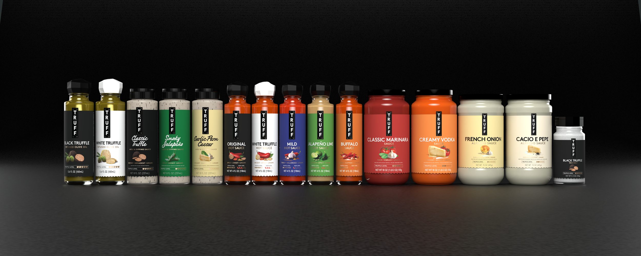
TRUFF Packaging
In August of 2025, I was tasked with redesigning the full line of TRUFF Products. This project included 17 SKUs across 5 consumer categories, and is the first rebrand in TRUFF’s short history. The goal with this project was to communicate product benefits more clearly to consumers, and help with subconscious decision-making. We wanted to answer questions that consumers have, before they even know to ask it. We wanted the packaging to carry meaning, rather than act as an ornament.
The Problem
With the growth of TRUFF Hot Sauce since it’s birth in 2016, a lot has changed. TRUFF moved from strictly DTC to being distributed nationwide at retailers like Kroger, Whole Foods, Sprouts, Target, HEB, and more. While the distribution has changed drastically over the years, the packaging had stayed the same. Built for DTC, meant to stand out on an Instagram feed, and expected to be accompanied by a A+ content and supporting product callouts. At shelf however, TRUFF’s minimal design left a lot of questions unanswered. How do we bring the benefits of the digital A+ content to shelf? This was the task at hand for the TRUFF Packaging redesign.
Design Breakdown
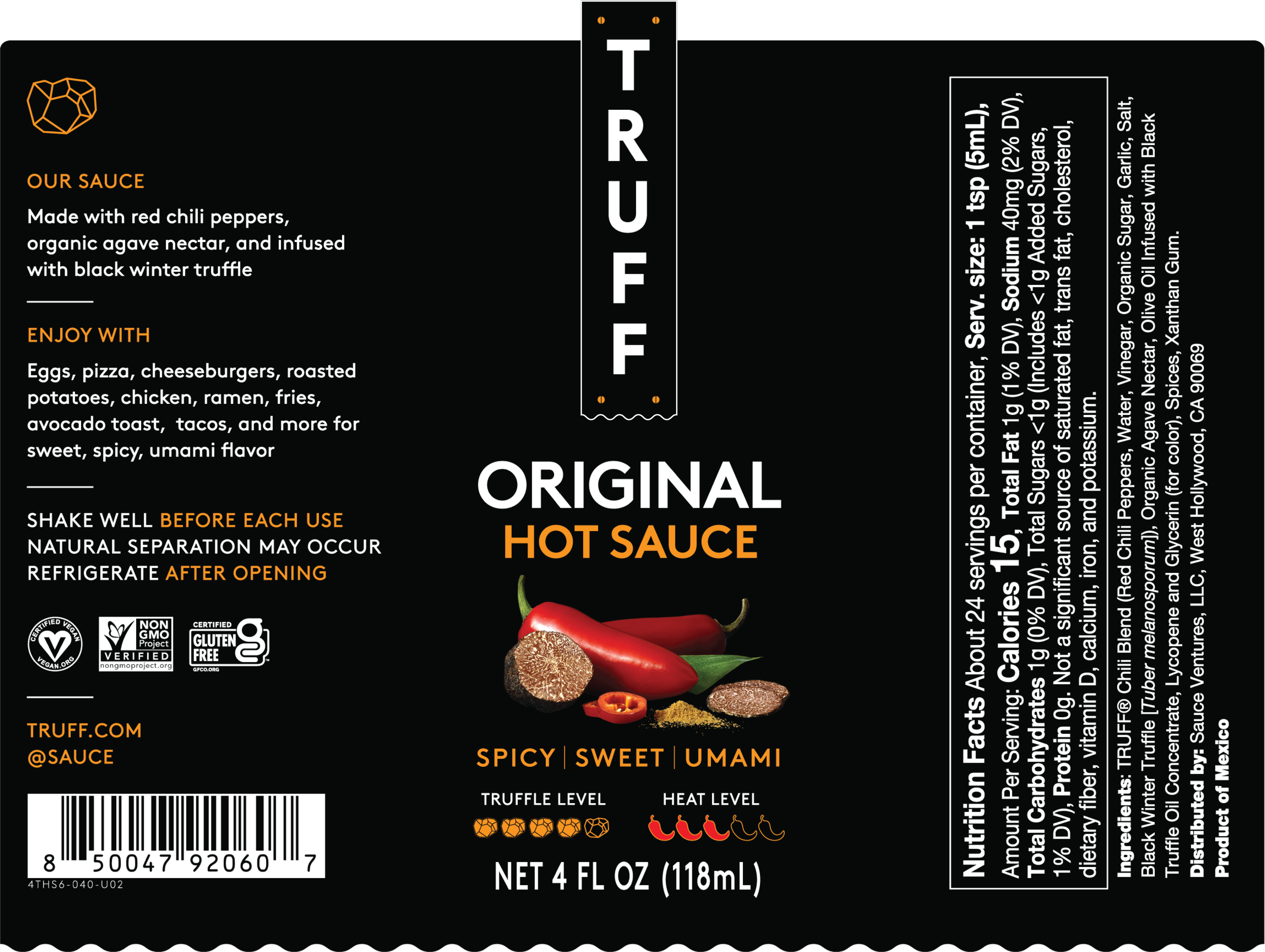
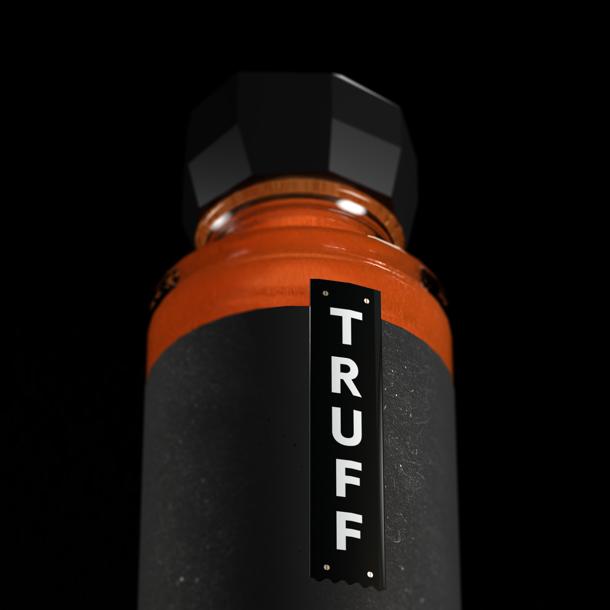
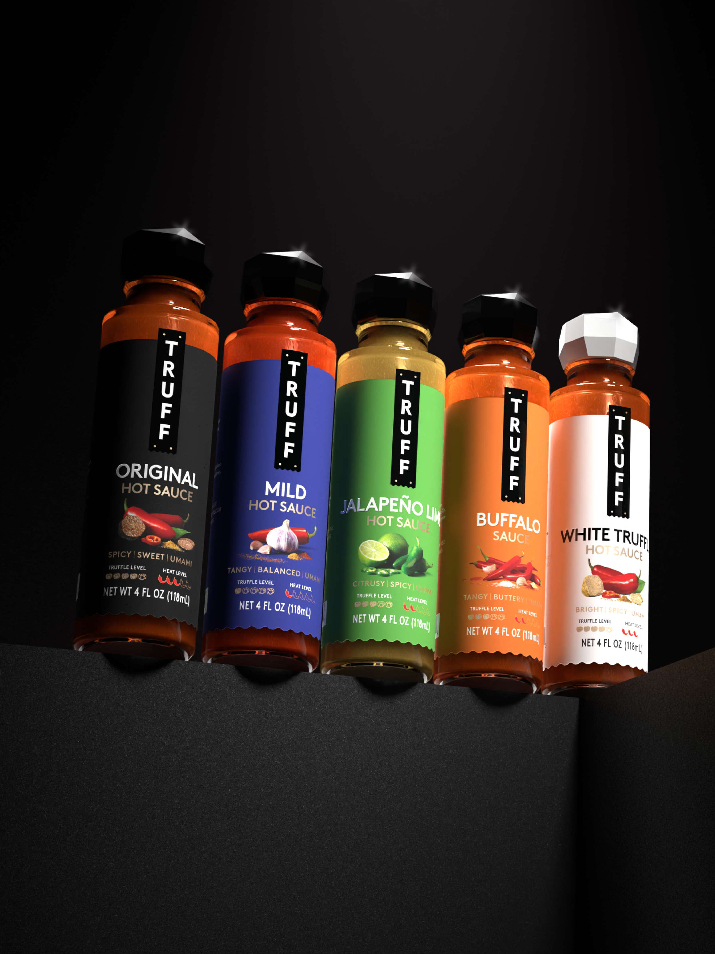
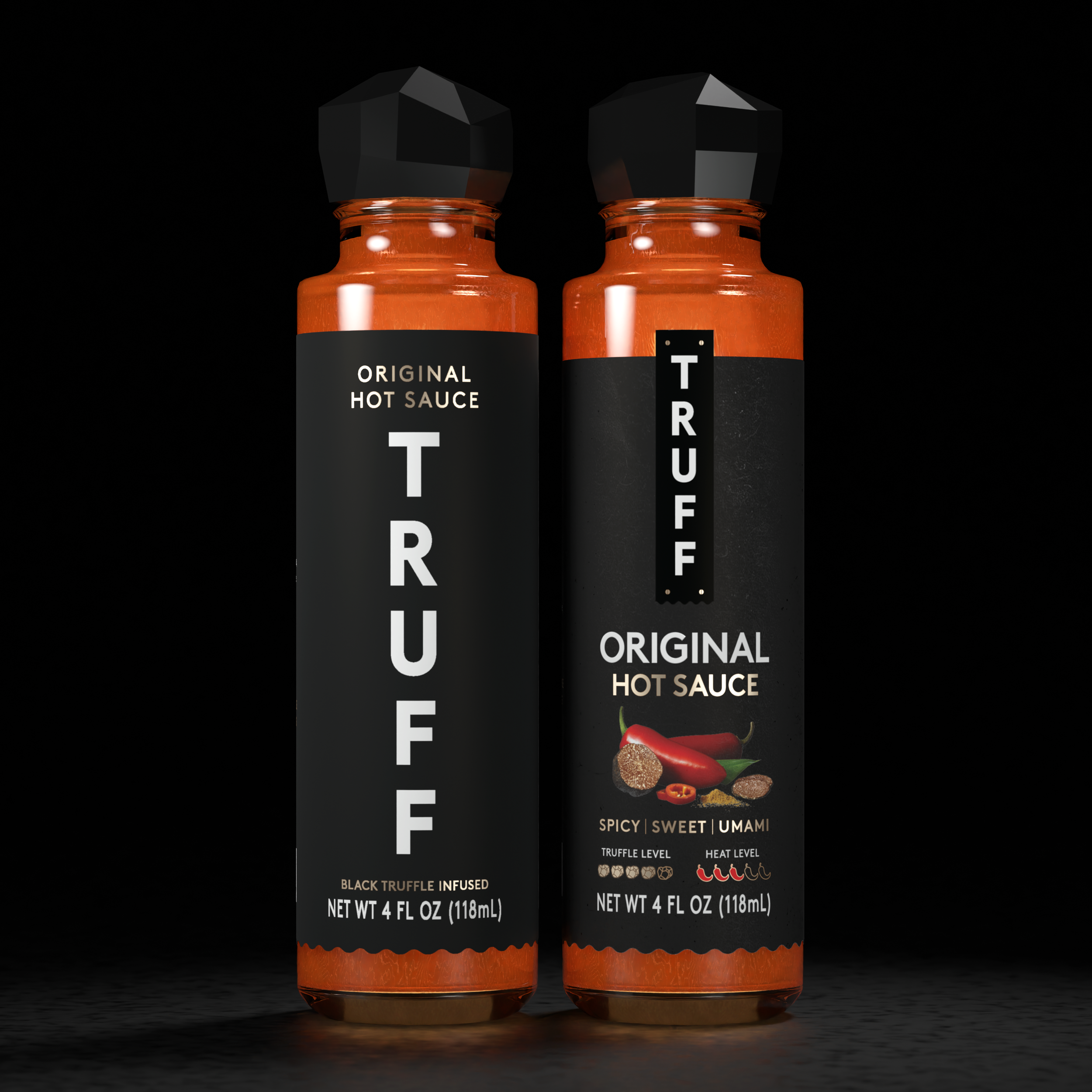
Same iconic vertical logo, used as a supporting asset rather than the main focal point.
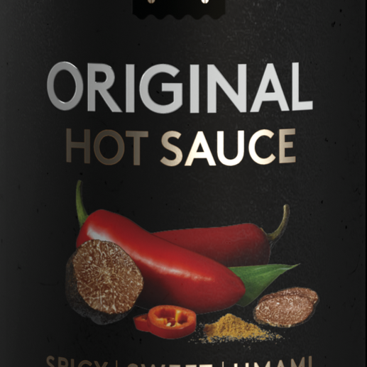
Larger flavor callout and product name, with new supporting flavor imagery.

3 distinguishing flavor notes for each product, along with a truffle level and heat level indicators.
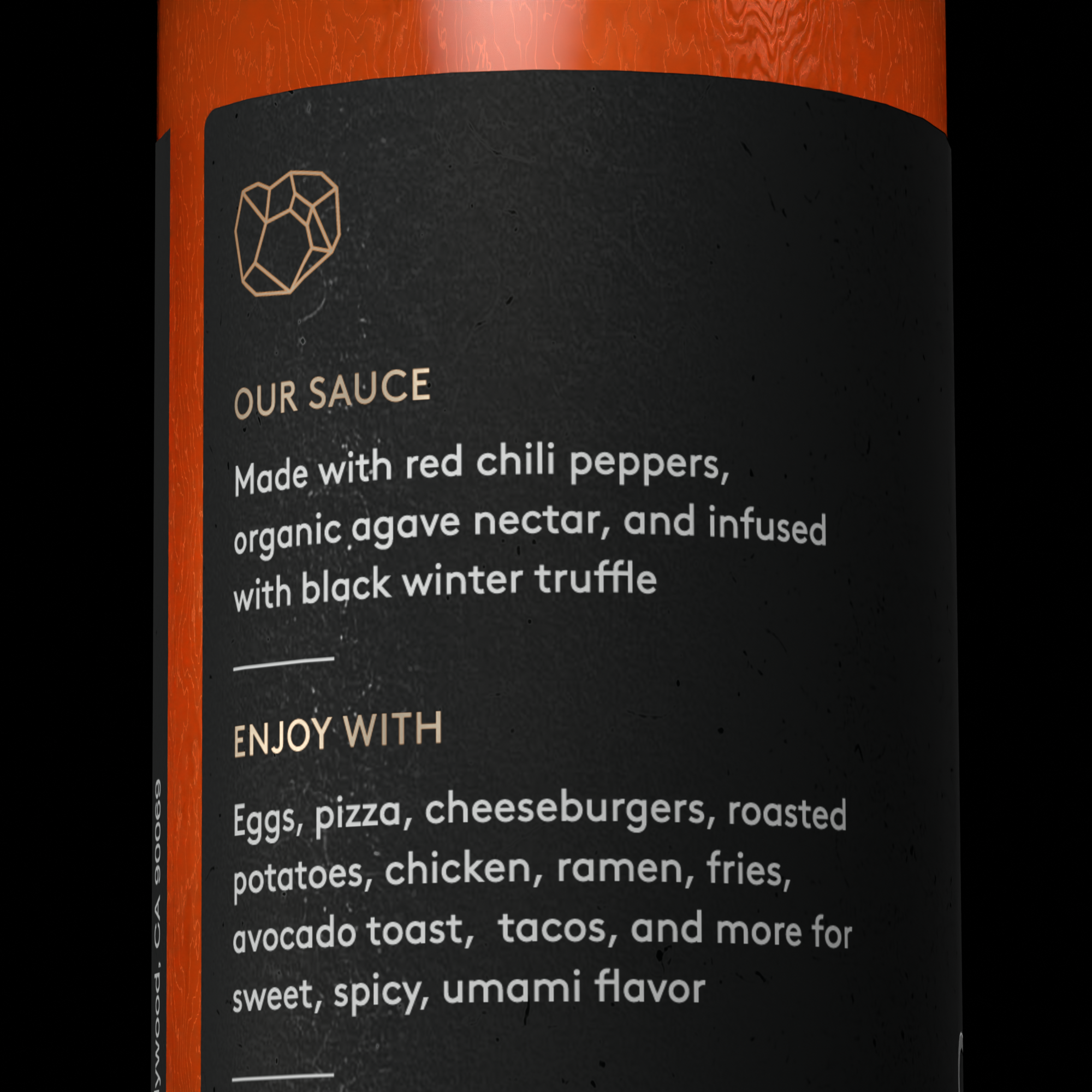
Updated romance copy and use case language to offer more product clarity.
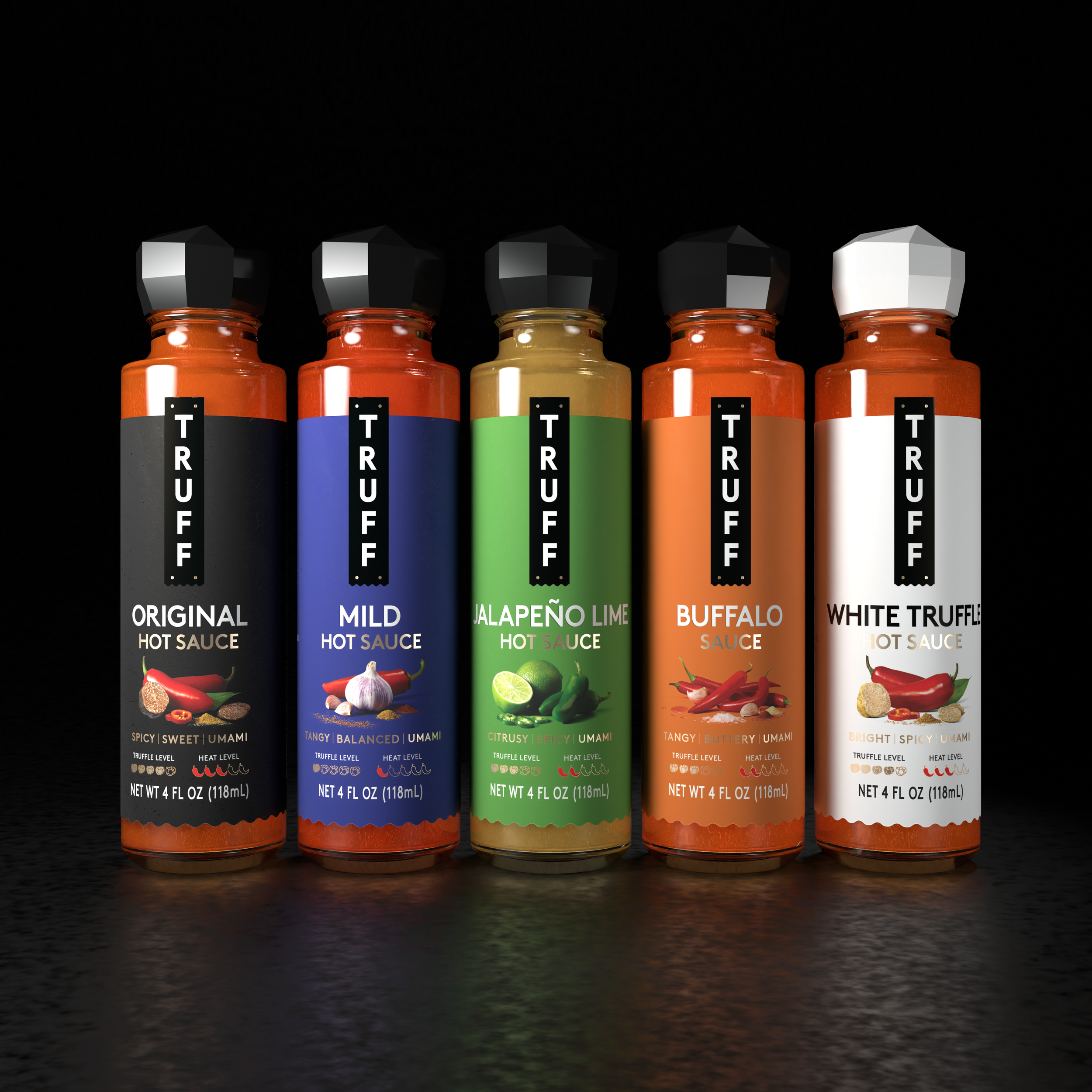
This visual structure is applied across all of TRUFF’s new product packaging. Previously, TRUFF had used a different colored cap for every hot sauce SKU to match the label. With this new structure, the truffle-shaped cap color now represents what kind of truffle it contains. Black Truffle = Black Cap, White Truffle = White Cap. This design decision will save tens of thousands of dollars for the company year after year, completely eliminating custom cap costs.