

GNC x Axe & Sledge
In April of 2024, Axe & Sledge was presented with an exciting opportunity to put their products on new shelves, those of the 2,500+ GNC storefronts nationwide. While being tasked with a new product lineup, fresh in-store graphics, and promotional content, our Axe & Sledge marketing team headed to GNC HQ in Pittsburgh, PA to establish our campaign alongside GNC’s in-house marketing team. Together, we were able to establish a modified brand identity for Axe & Sledge, in order to curate content for the average supplement enjoyer, as opposed to the more “intense” image the brand portrays on its own.
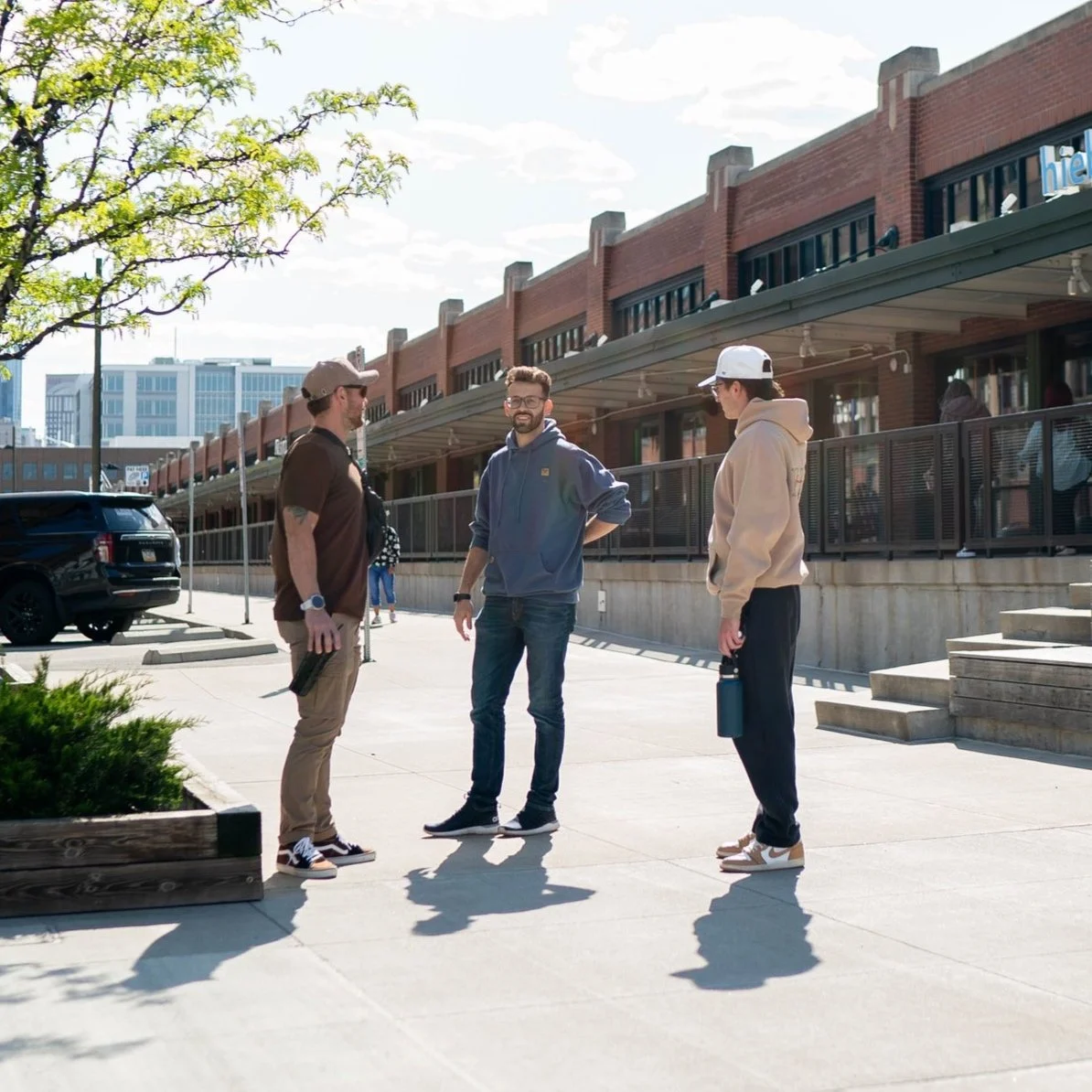
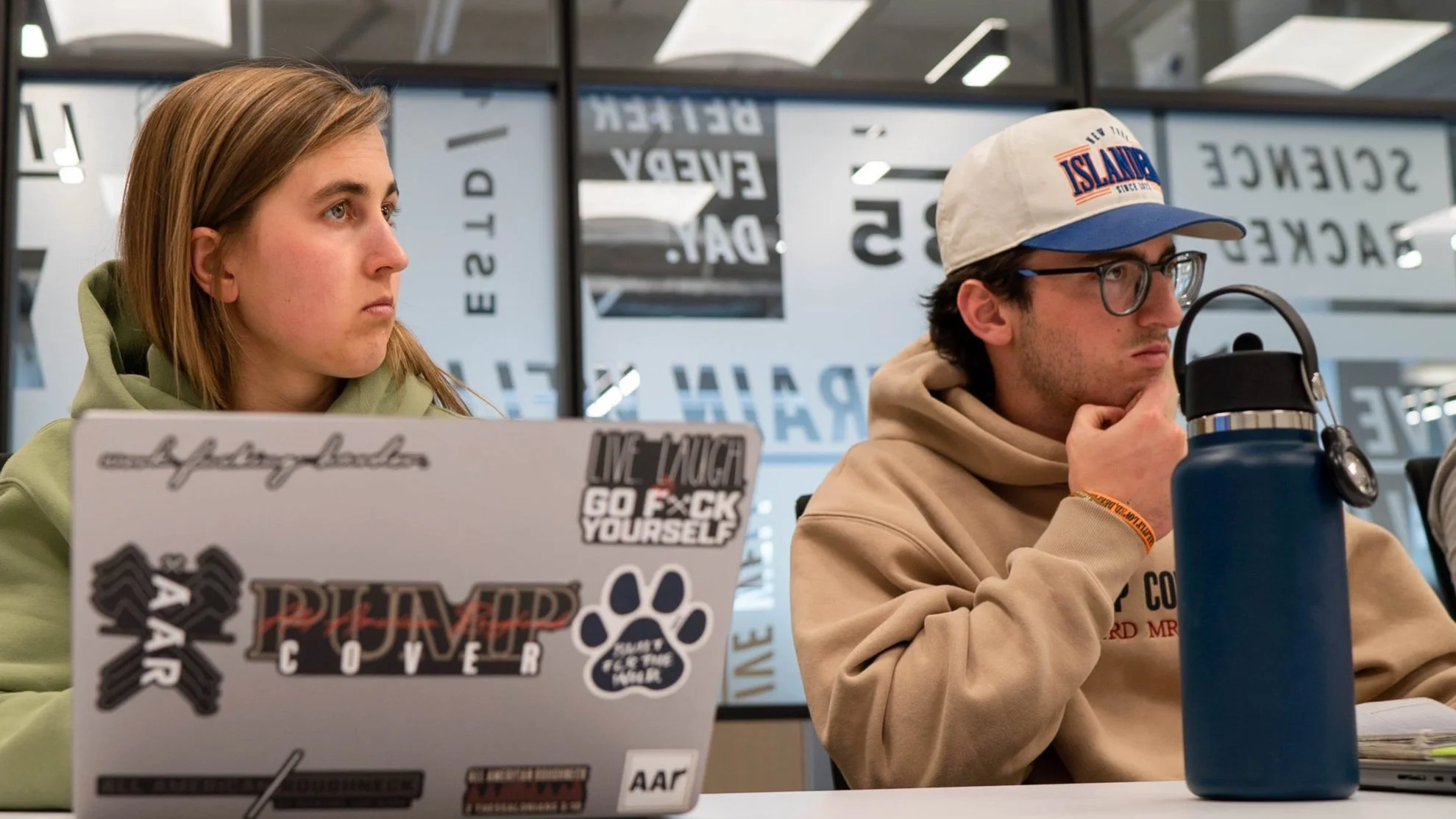
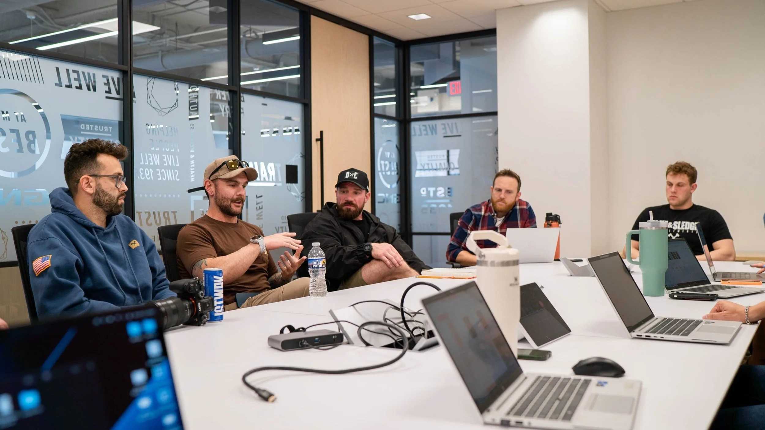
Pictures from our visit to GNC HQ in April 2024. We wanted to make an impact when the new products hit shelves in July, and this involved a lot of back and forth between the two marketing teams. With the edgy and rugged nature of Axe & Sledge matched with the clean and polished image of GNC, this required a bit of compromise from both sides. With the goal in mind to find some middle ground, we got to work and shared ideas that would leave both parties satisfied.
Visual Branding | Internal
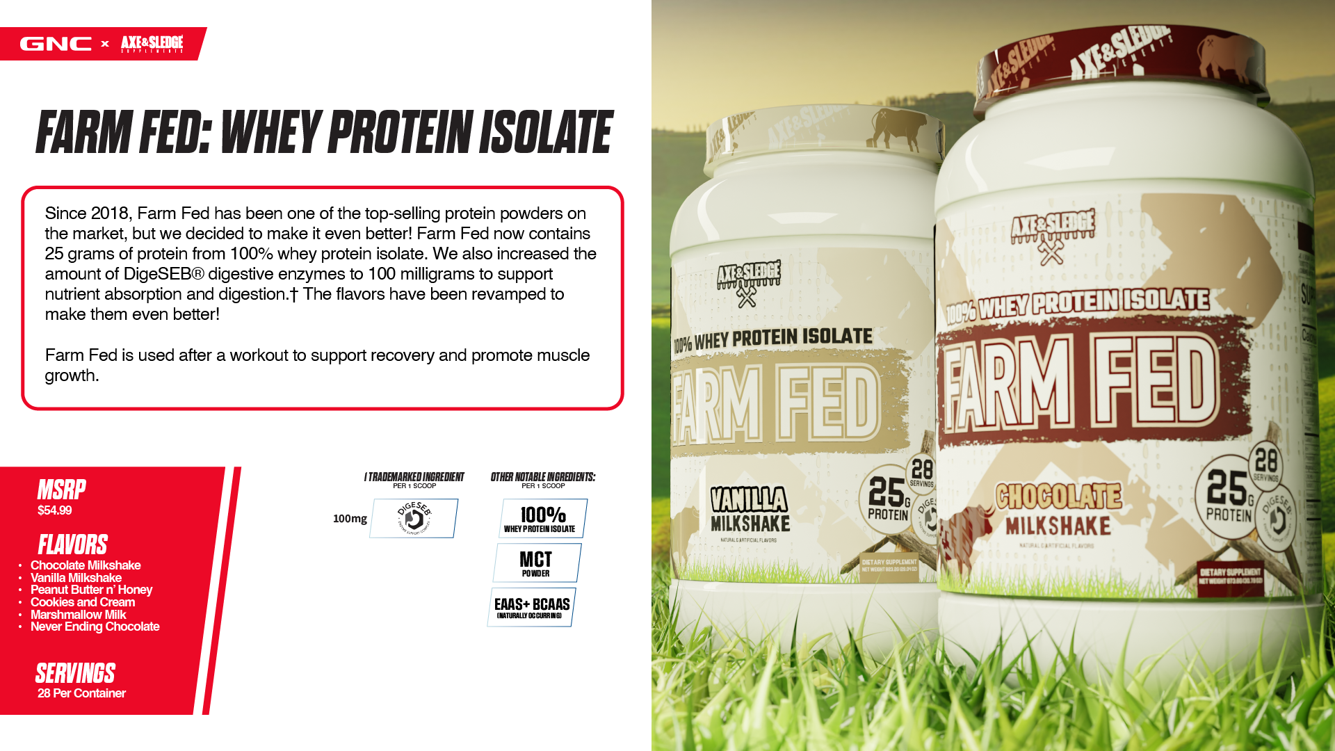
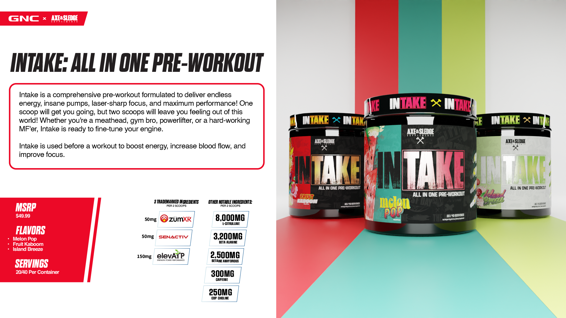
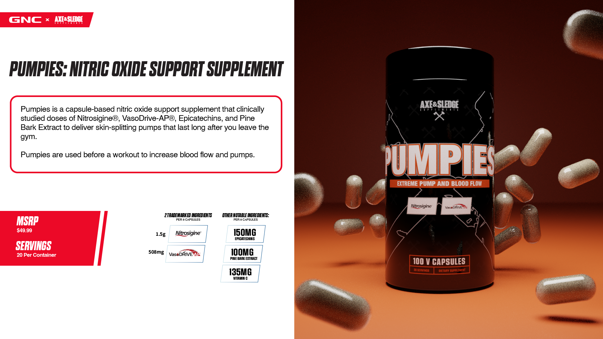
I created a new design structure to display Axe & Sledge products internally through a GNC lens, with the idea of offering the GNC team a look at our products as if they were already apart of their lineup. This makes it easier for stakeholders to focus solely on the products themselves, and eliminates many questions before they are even asked. Comprehension is key when introducing people to unfamiliar products, and framing it in a way that is easy to understand leads to quicker decisions and more impactful conversations.
Visual Branding | External
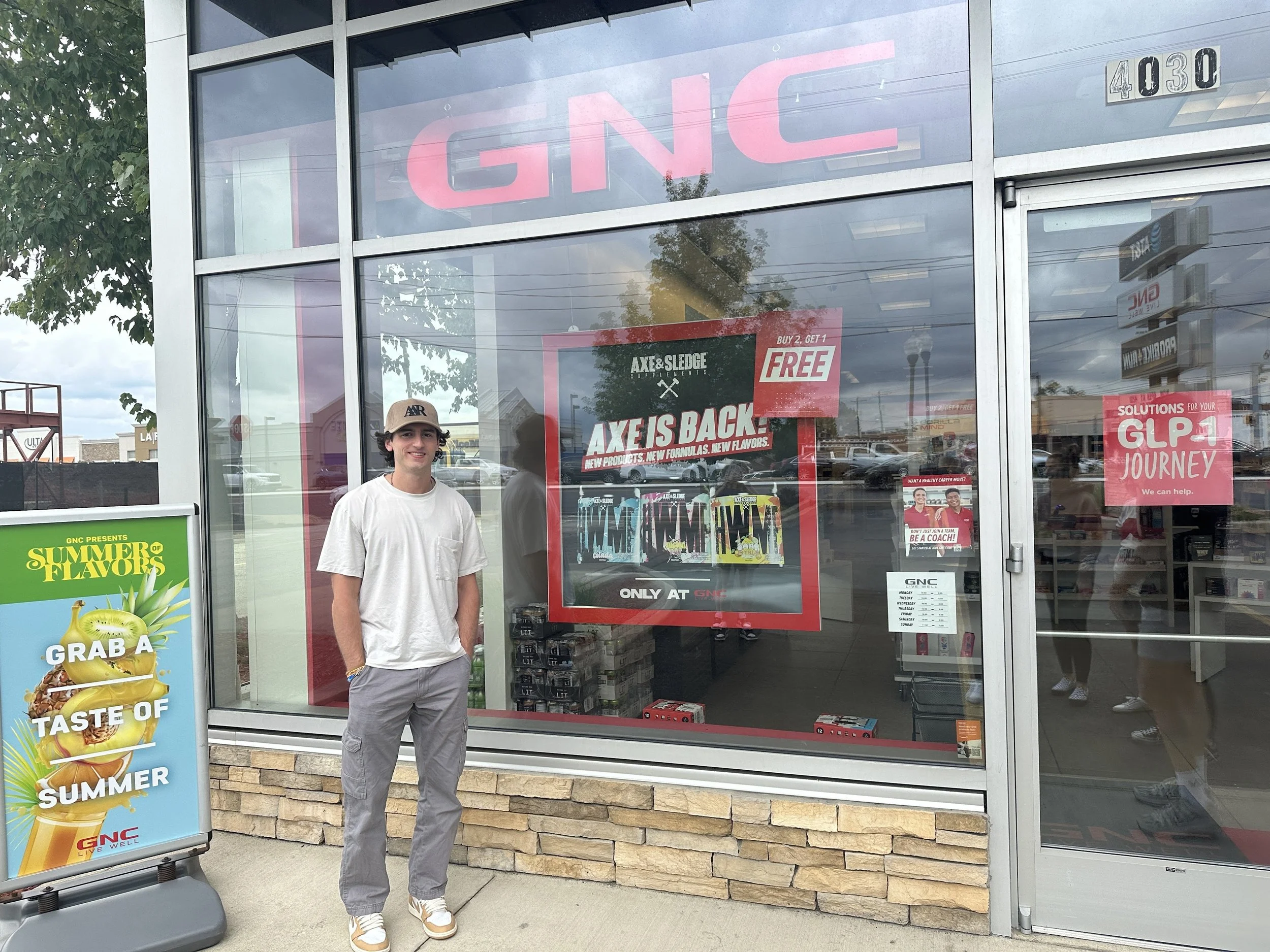
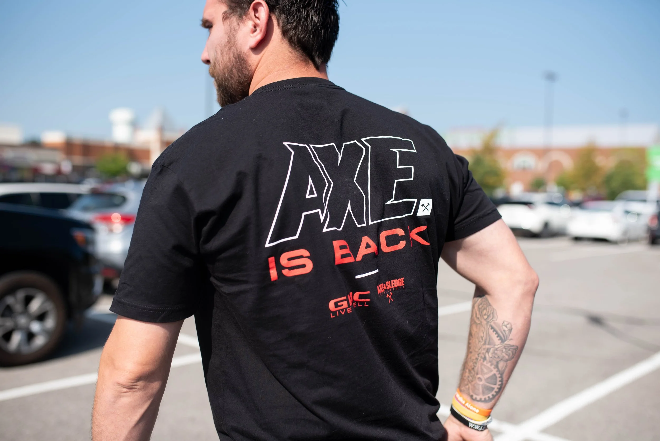
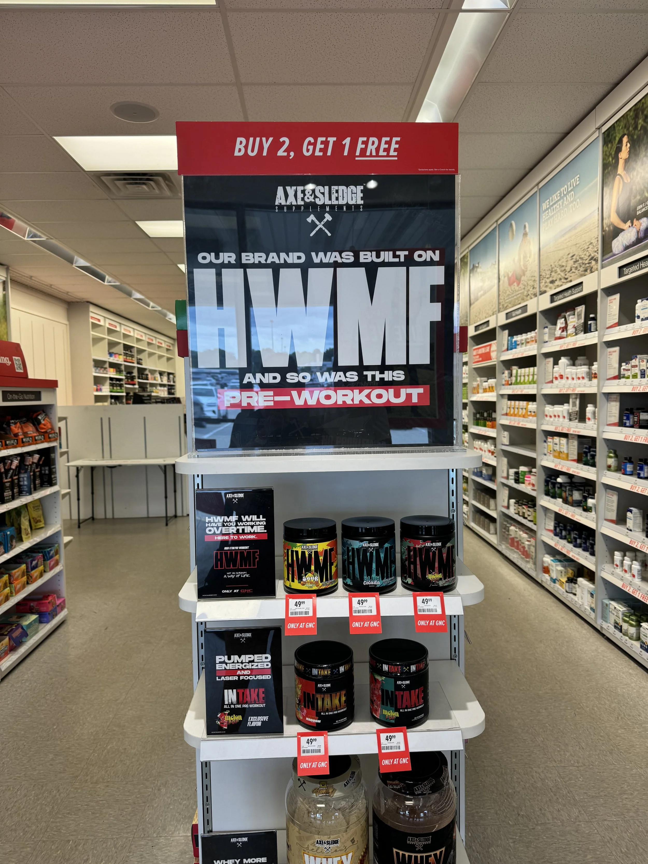
The internal materials were praised for their consistency and familiarity, however, creating in-store signage and promotional content needed to be approached a bit differently. This content needed to be much more disruptive and show more of Axe & Sledge’s true colors. One of the Co-Owners and IFBB Pro, Seth Feroce, wanted to include a huge, bold, line of text that read “HWMF” (Hard Working M***** F*****). Obviously, you can imagine some of the pushback that was received from GNC after this was pitched, but in order to capture the true essence of Axe & Sledge and get the in-store reaction we wanted, we had to find some middle ground.
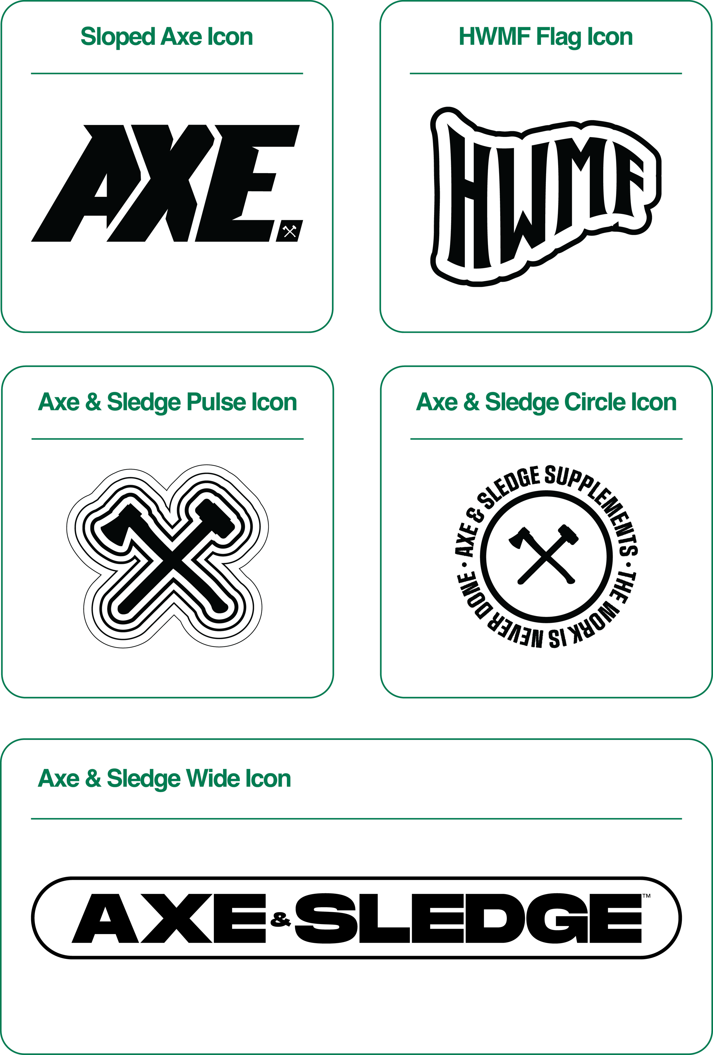
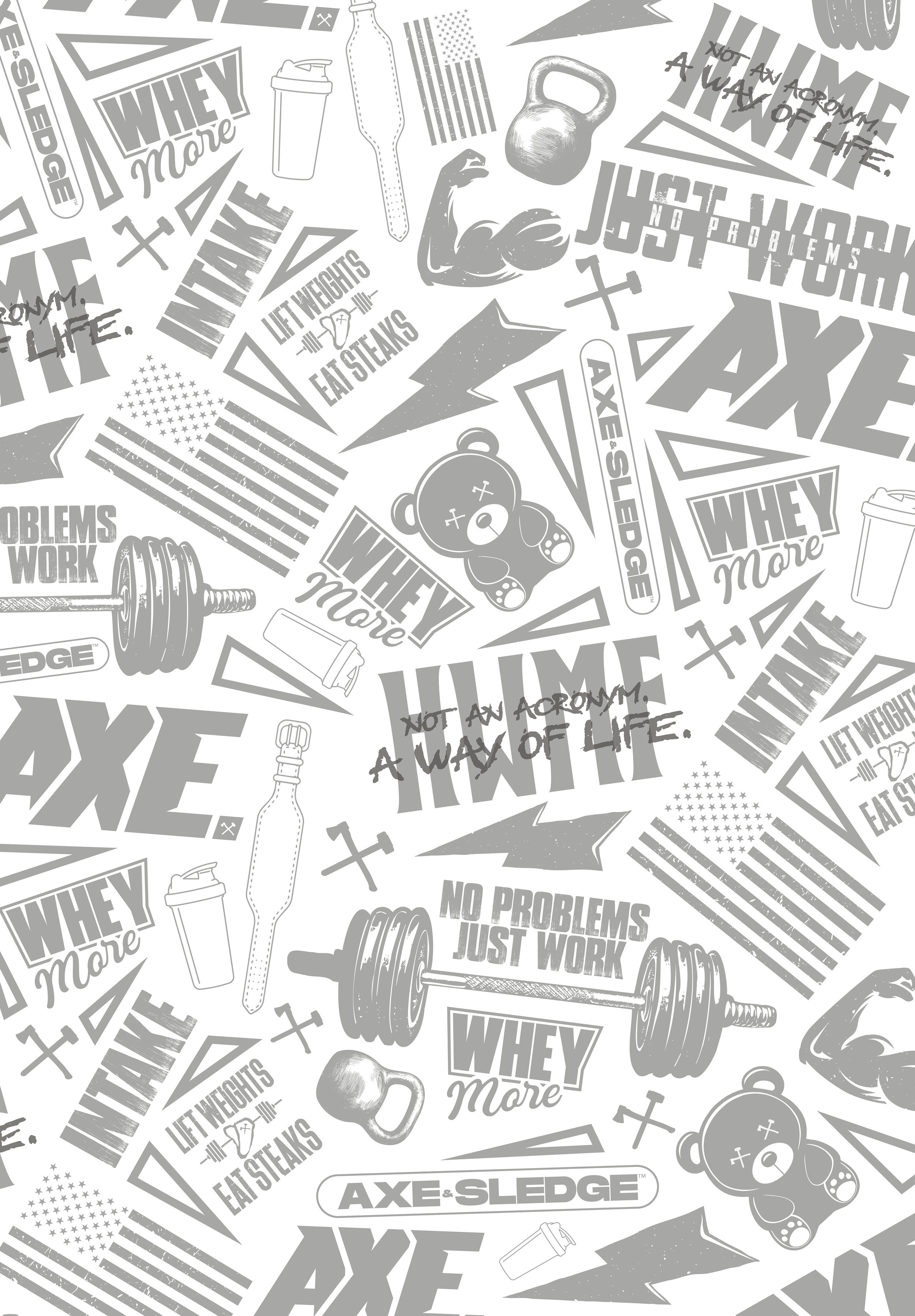
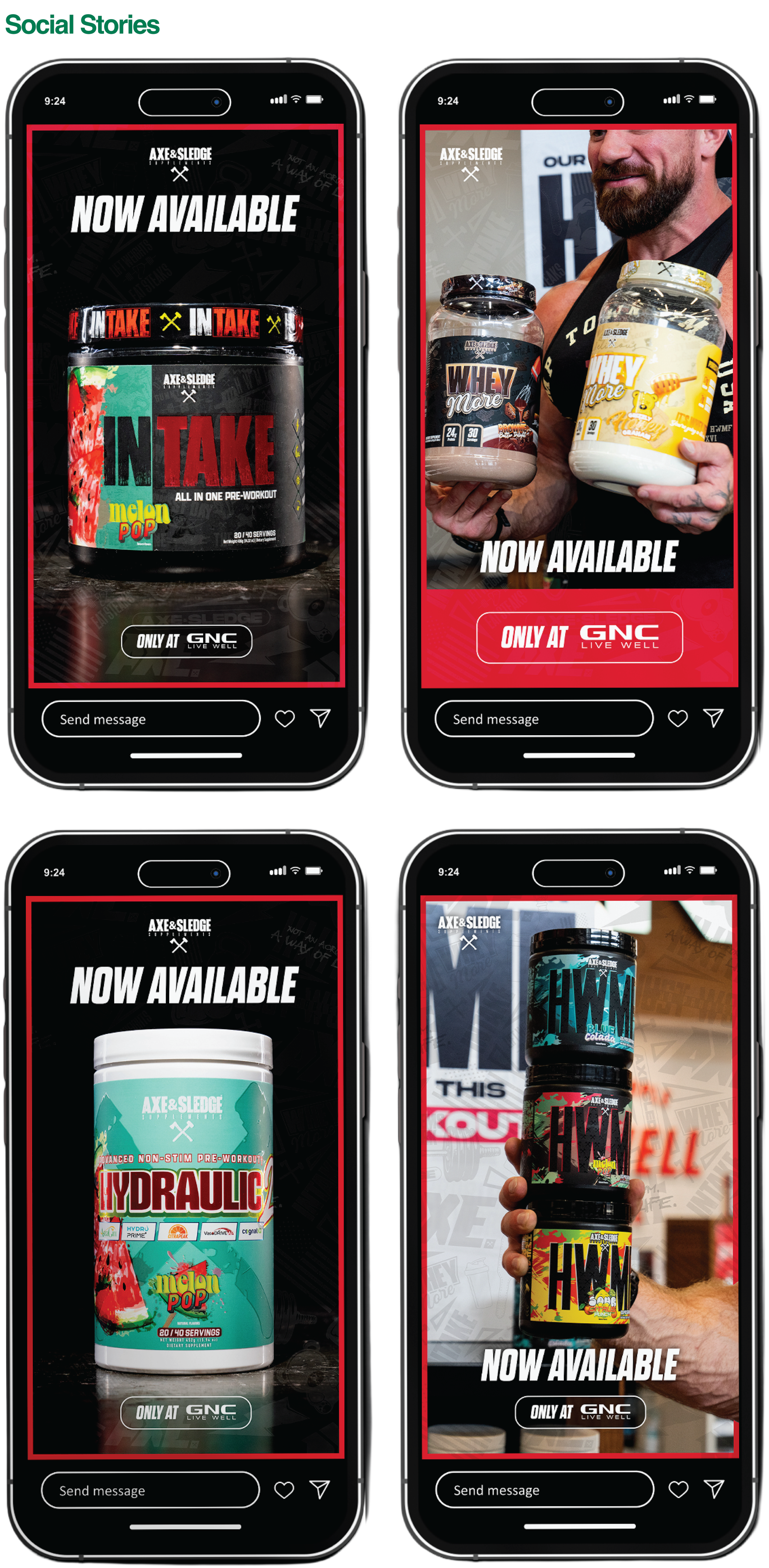
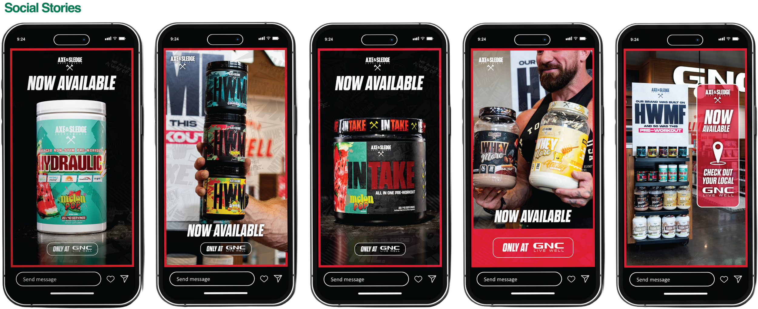
I developed a “deli paper” style pattern that incorporated new icons mixed with some previously used flavor icons and other recognizable assets, specifically ones that portray the core values of Axe & Sledge. Below are examples of the patterns and icons developed, along with final in-store signage and some of the supportive social media content.

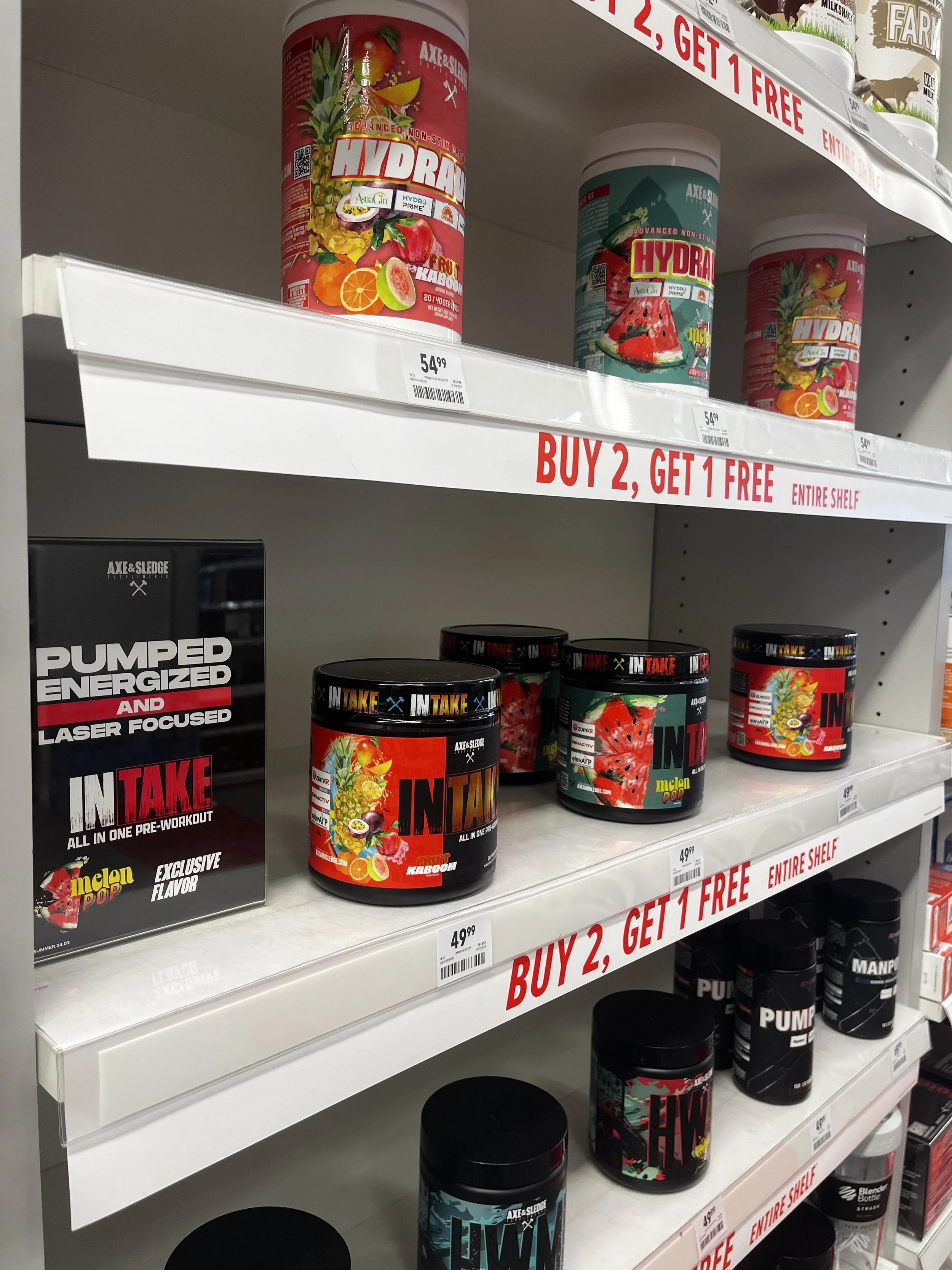
The launch was a massive success on all fronts, and GNC was pleasantly surprised with the impact Axe & Sledge had on foot traffic in their stores. This successful collaboration led to further opportunities for partnerships and events with GNC (e.g. Pump Fest) and other distributors alike.