

Axe & Sledge Farm Fed
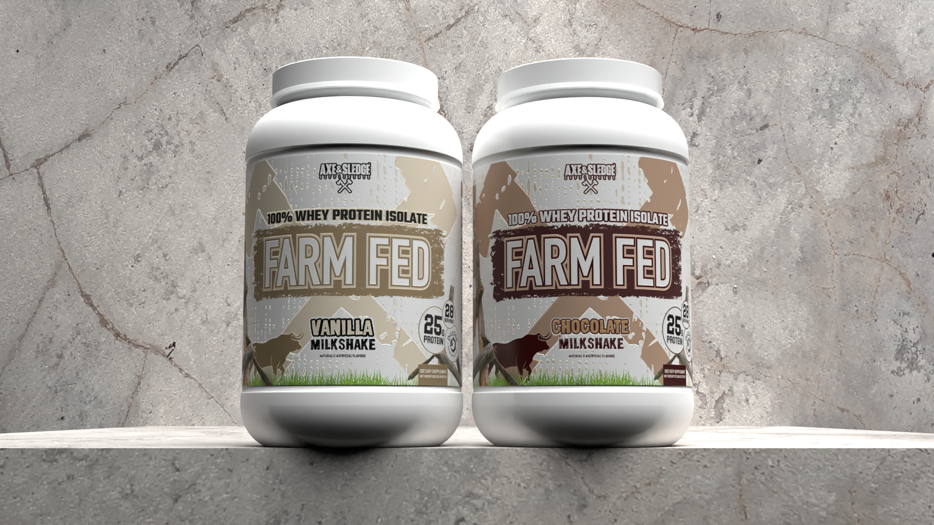
In January of 2024, I was in charge of redesigning the Axe & Sledge Farm Fed Protein labels. With Farm Fed as the Axe & Sledge’s flagship product and no notable packaging changes since the company was founded in 2016, Axe & Sledge was looking for a revamp of the existing packaging, keeping the majority of the label structure relatively the same. The result still lives on retailer shelves across the US today, including GNC, Vitamin Shoppe, Nutrition Faktory, Supplement Superstores, and more.
The Problem

The Pre-existing design had been a part of Axe & Sledge’s initial launch and lended a hand in the early success of the company, but after 7 years it was time for a new look for this staple product. The old design had limited SKU distinction, and lacked appetite appeal. At a quick glance the products look the same, and at shelf, this is a huge issue. To make the most of all shelf space, a fresh new look was necessary. This new design needed to be appealing at a glance, give a clear distinction between flavors, and still resemble previous Axe & Sledge products for repeat customers.
New Look
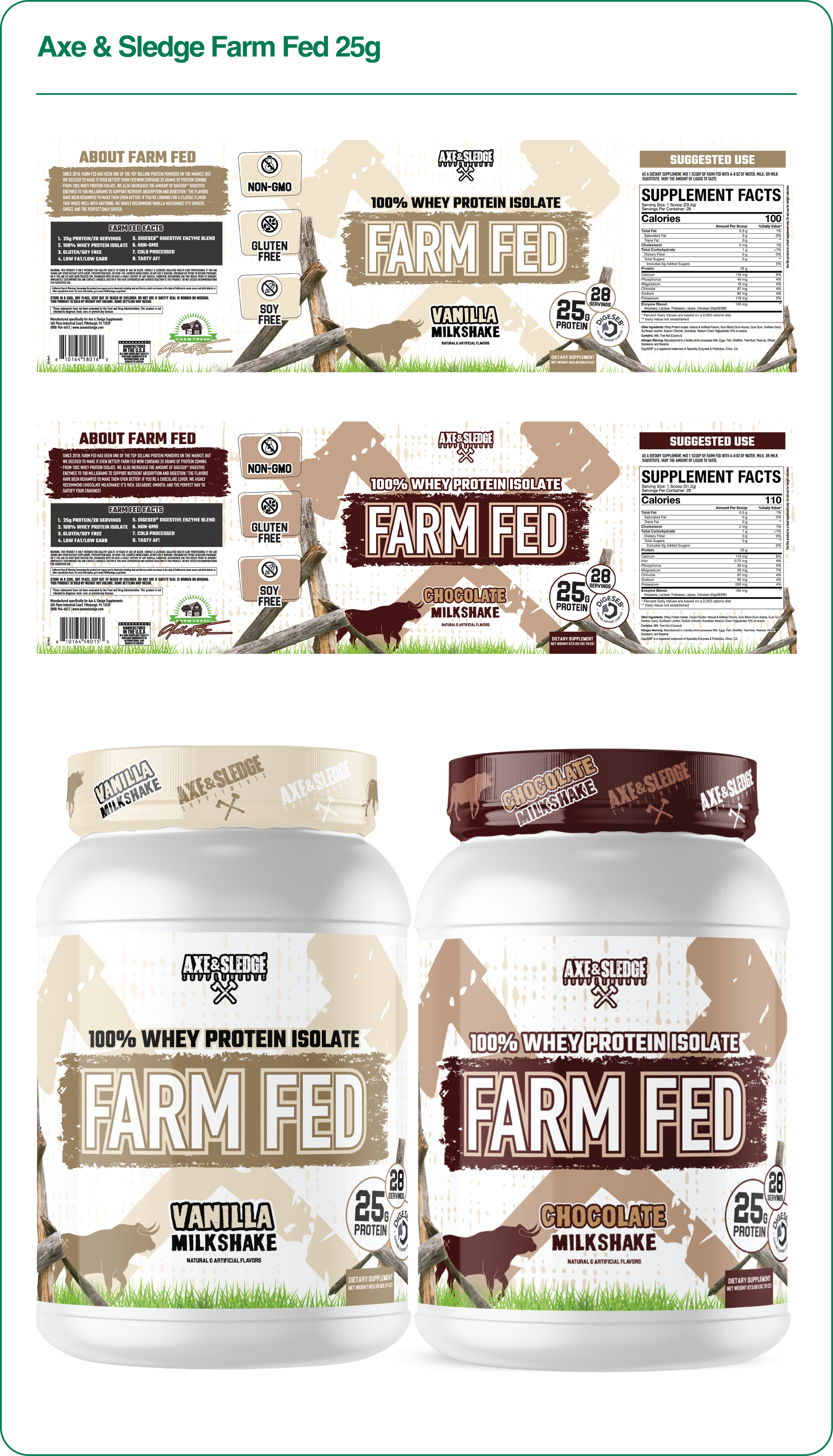
The new design offers a much clearer product name, an updated color palette to assist with flavor distinction and appetite appeal, more distinct product benefits, and the ability to expand this core lineup through a simple color change (later executed in 2025 with the Strawberry Milkshake Farm Fed). Now consumers know within the fist glance what product they’re looking at, the flavor profile, and all product benefits with much less friction than before. This helps Axe & Sledge win at shelf every single day, and has helped boost them into further success.