

Axe & Sledge x GNC
In April of 2024, Axe & Sledge was presented with an exciting opportunity to put their products on new shelves, those of the 2,500+ GNC storefronts nationwide. While being tasked with a new product lineup, fresh in-store graphics, and promotional content, our Axe & Sledge marketing team headed to GNC HQ in Pittsburgh, PA to establish our campaign alongside GNC’s in-house marketing team. Together, we were able to establish a modified brand identity for Axe & Sledge, in order to curate content for the average supplement enjoyer, as opposed to the more “intense” image the brand portrays on its own.
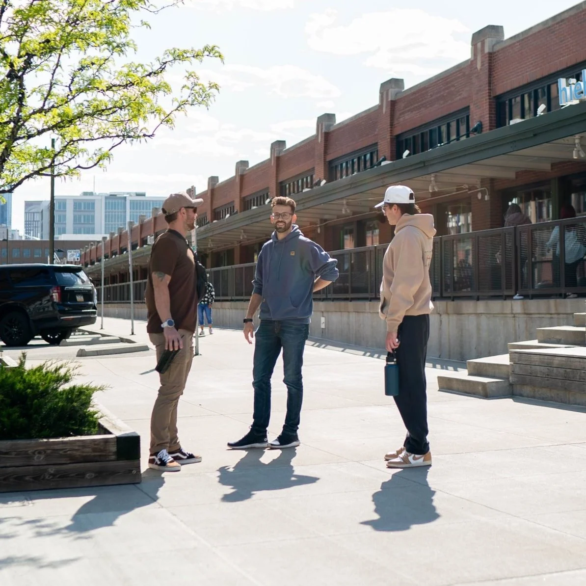
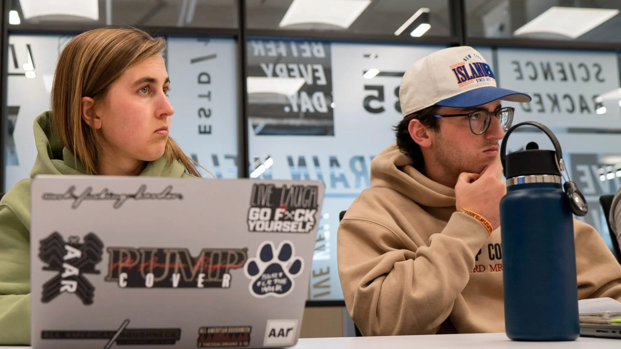
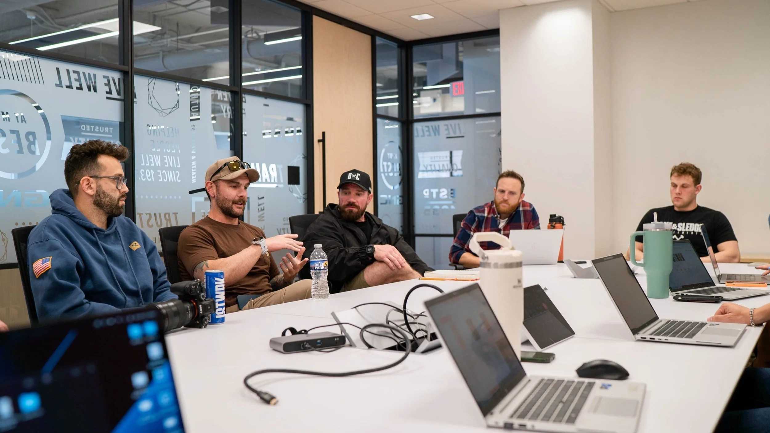
Pictures from our visit to GNC HQ in April 2024. We wanted to make an impact when the new products hit shelves in July, and this involved a lot of back and forth between the two marketing teams. With the edgy and rugged nature of Axe & Sledge matched with the clean and polished image of GNC, this required a bit of compromise from both sides. With the goal in mind to find some middle ground, we got to work and shared ideas that would leave both parties satisfied.
Visual Branding
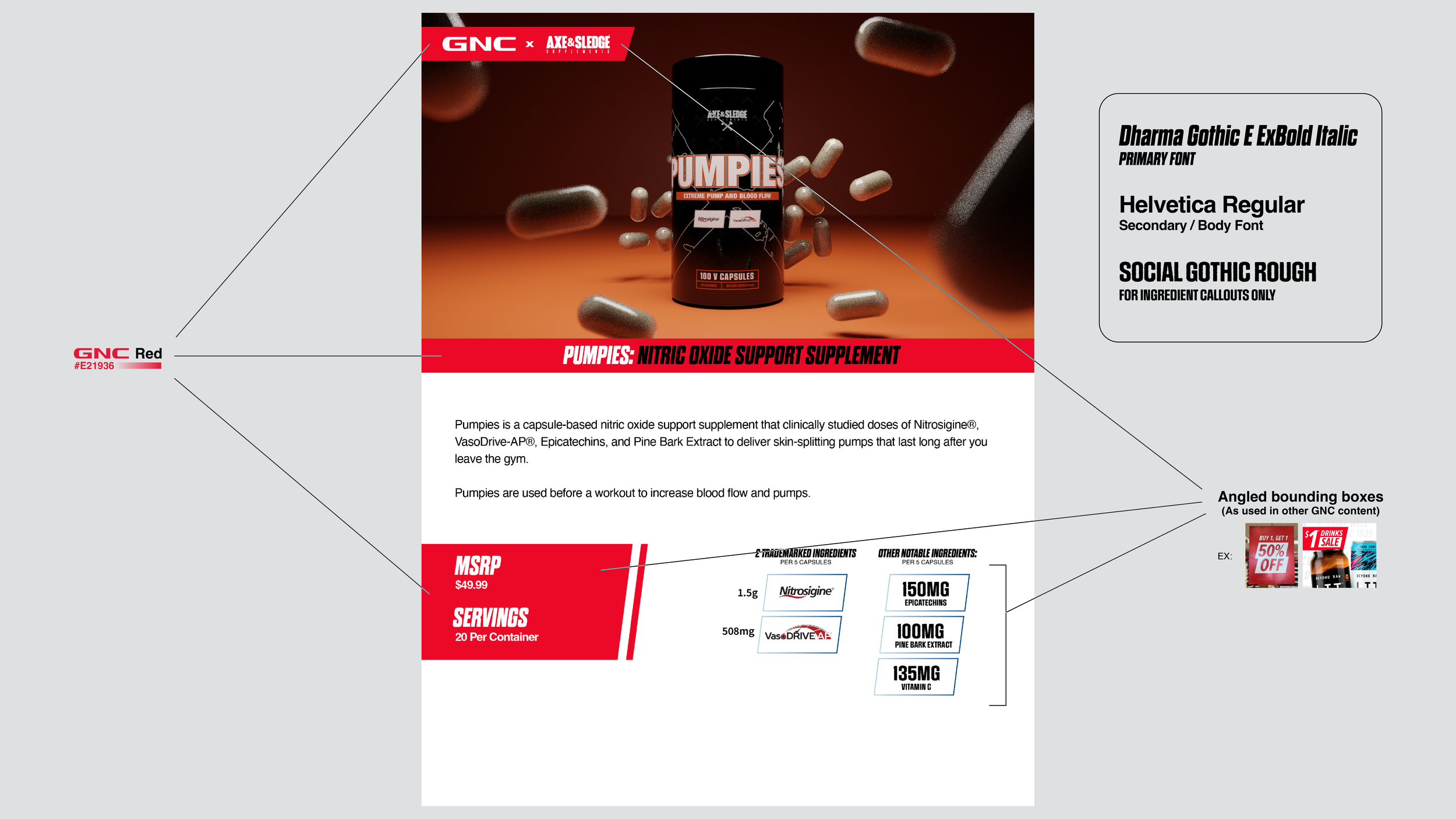
With this upcoming collaboration, I needed to consider how we wanted to portray Axe & Sledge to GNC (for content like internal presentations and product pitches) and consumers (In-store signage, promotional materials, etc.) differently. For internal content, I wanted to make it seem as if Axe & Sledge has always been a part of GNC. Using GNC Red, including minimalistic text framing and a comfortable typeface like Helvetica, I was able to build presentations and informational material that is familiar to look at for GNC decision makers.
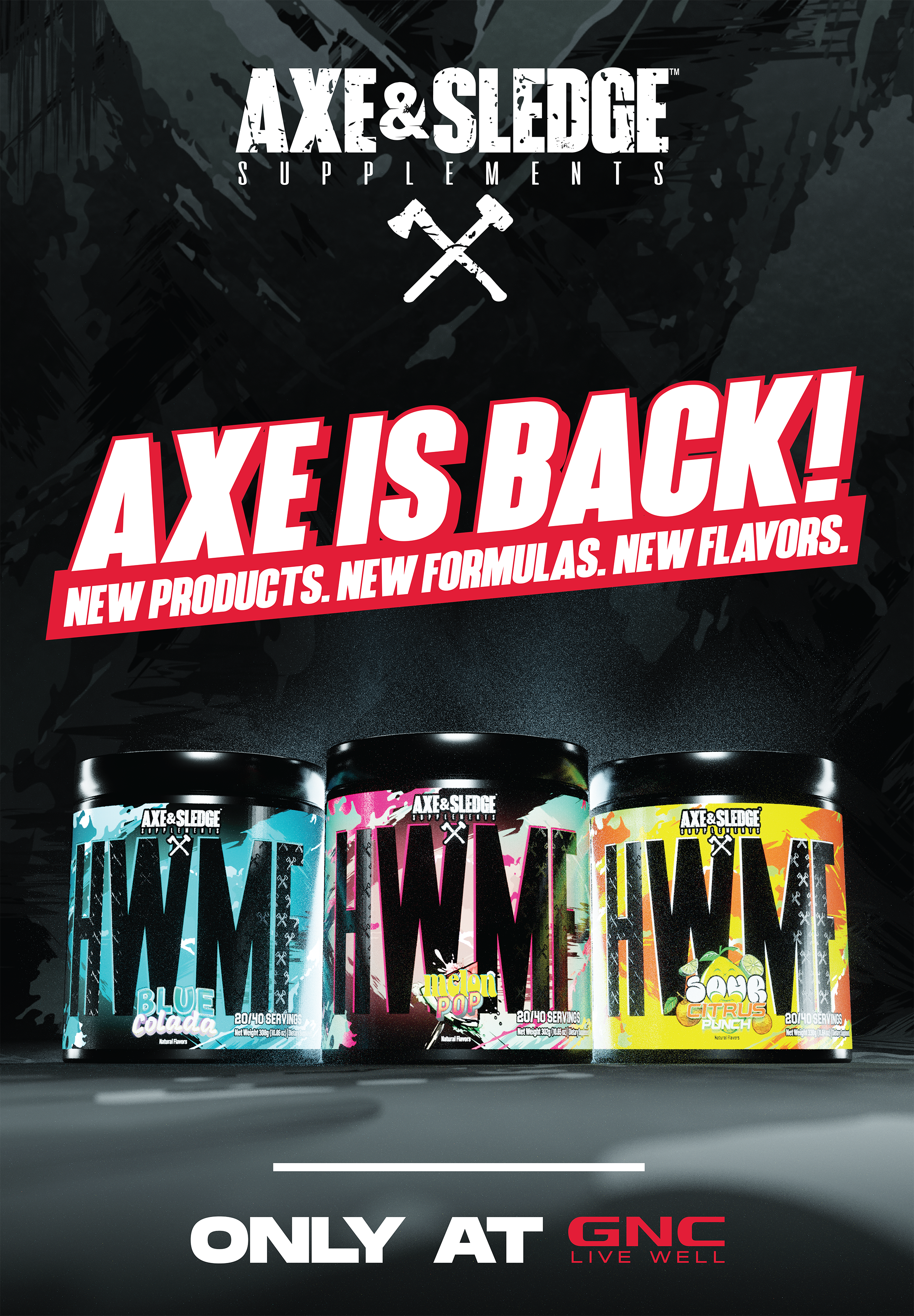
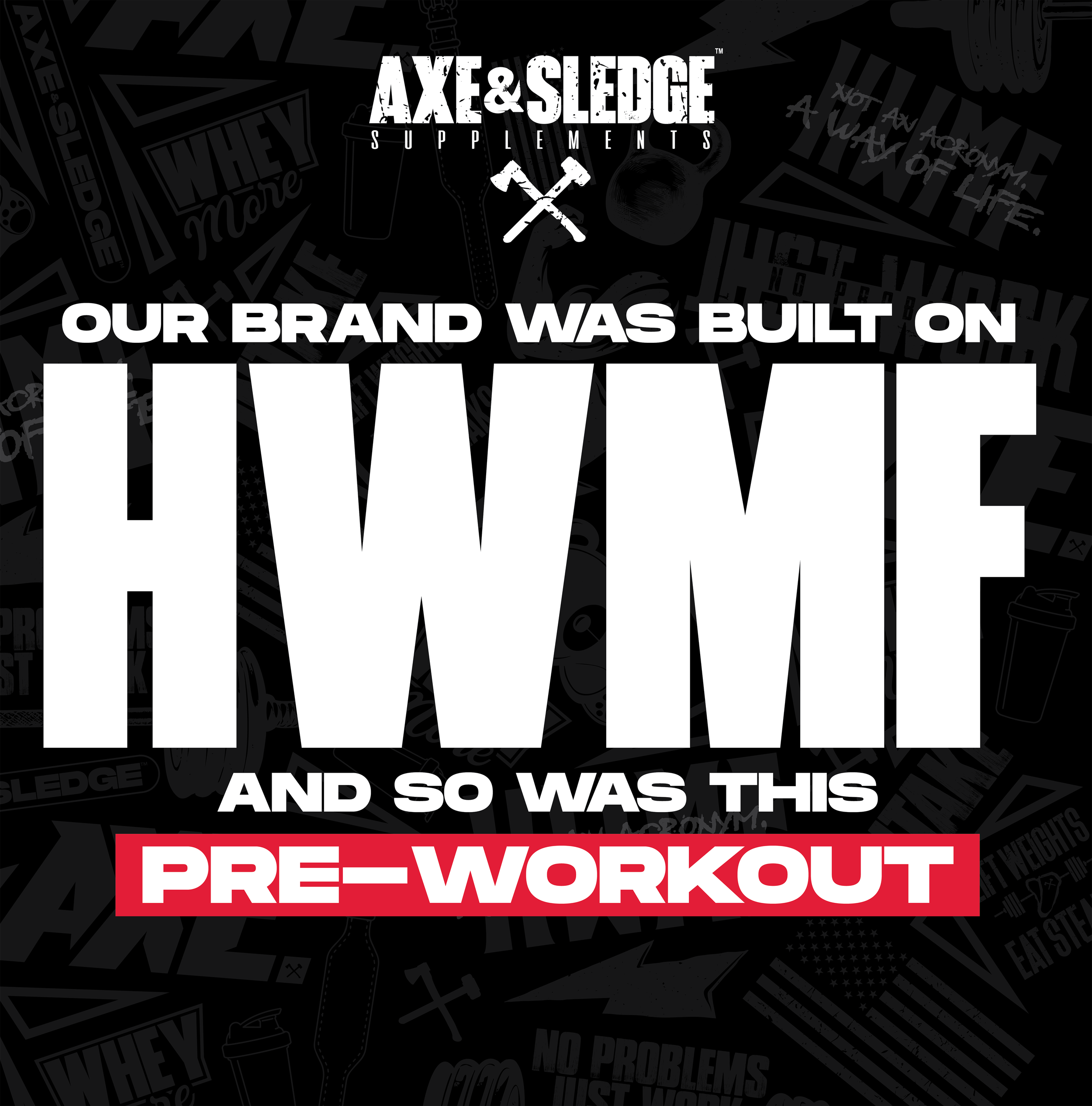
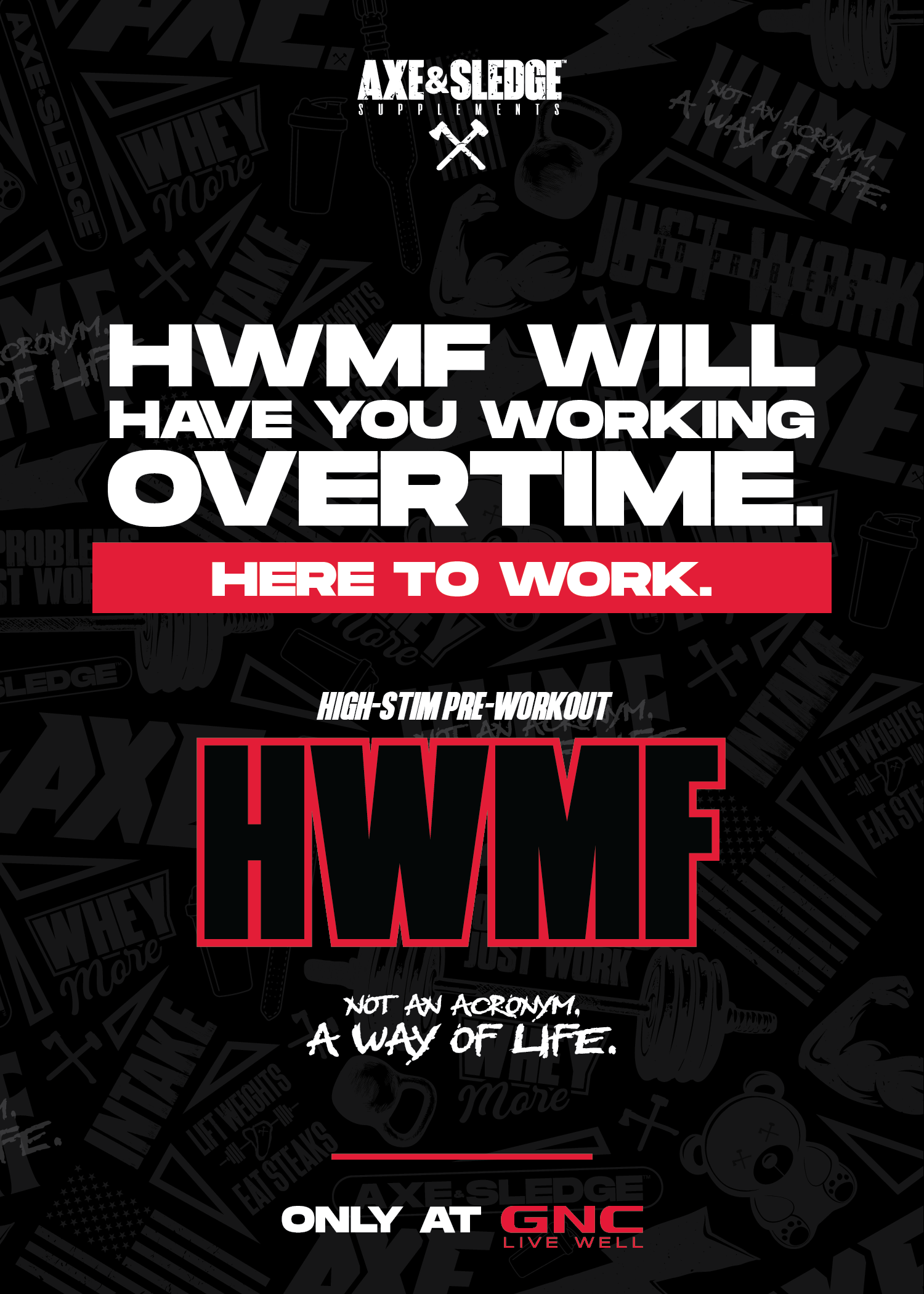
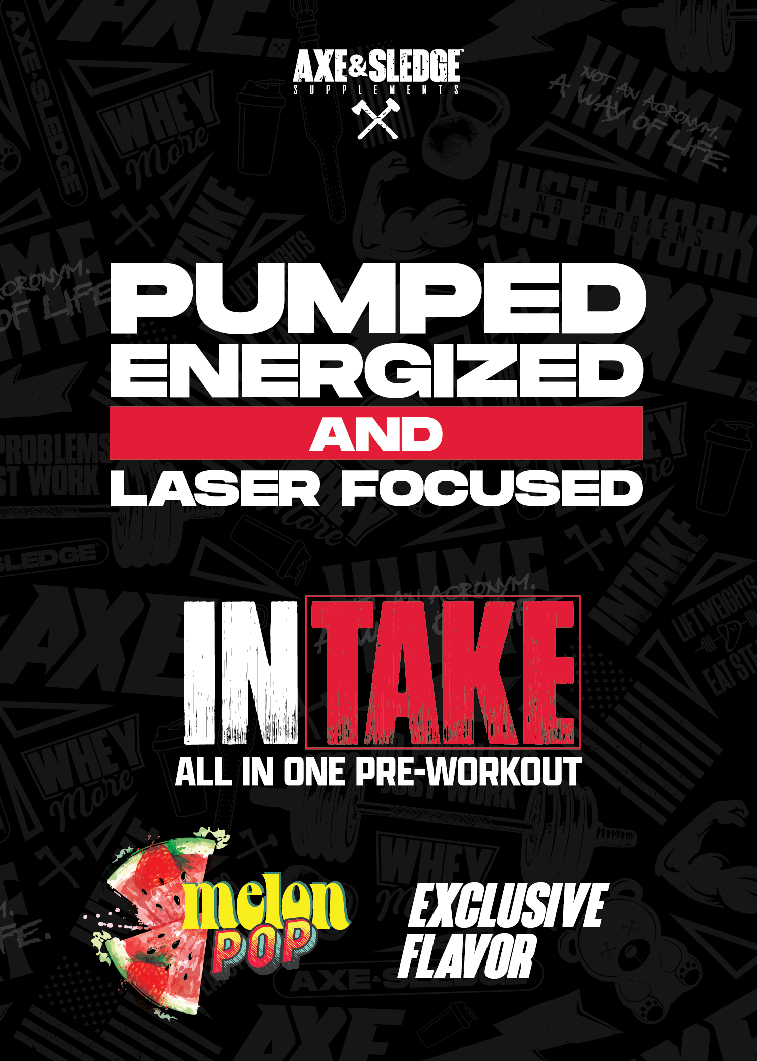
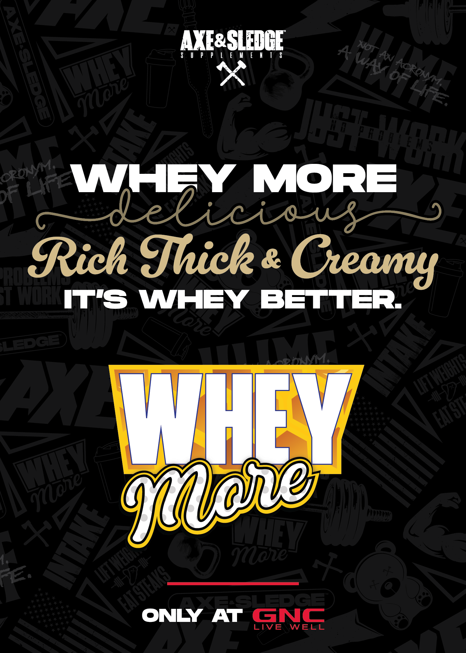
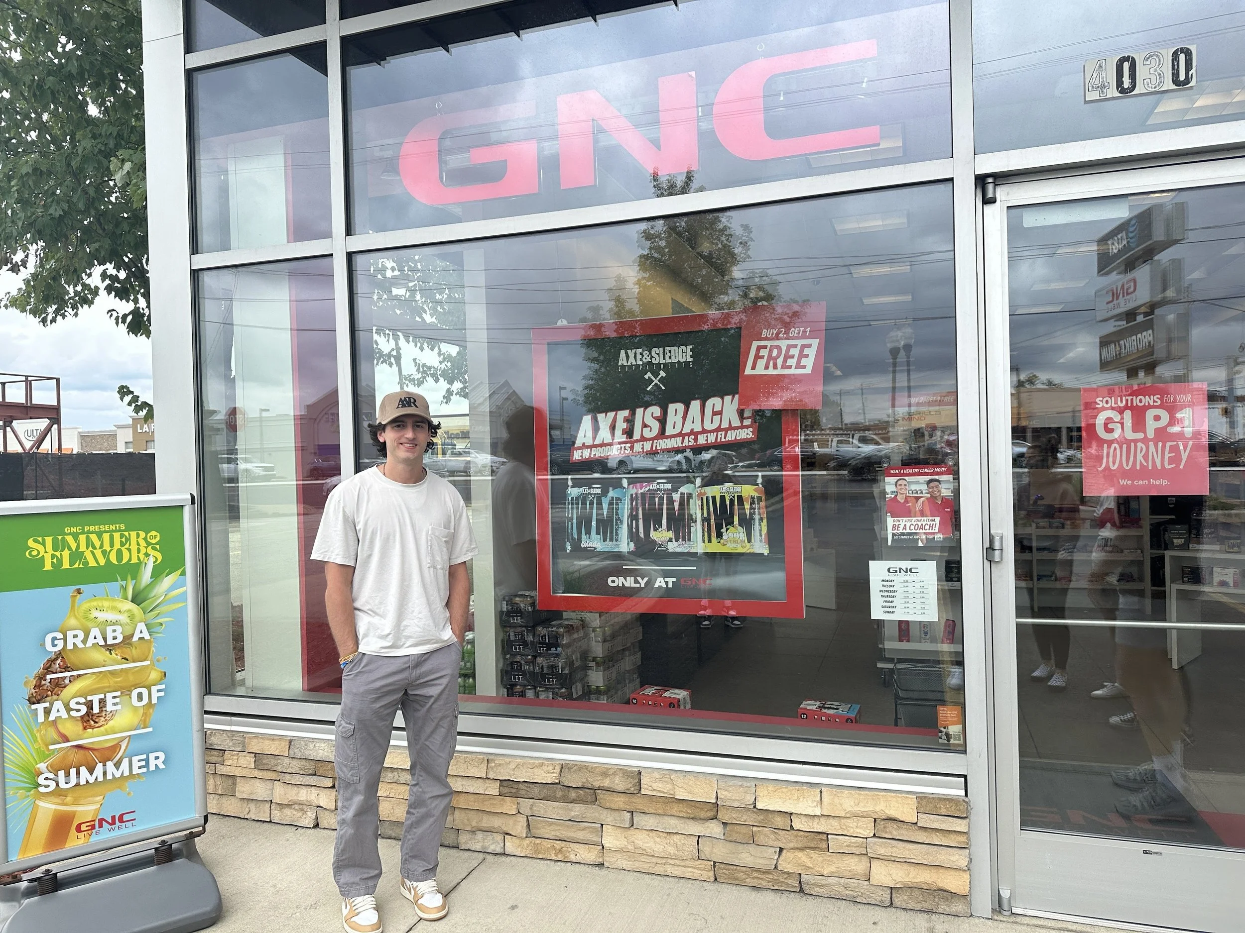
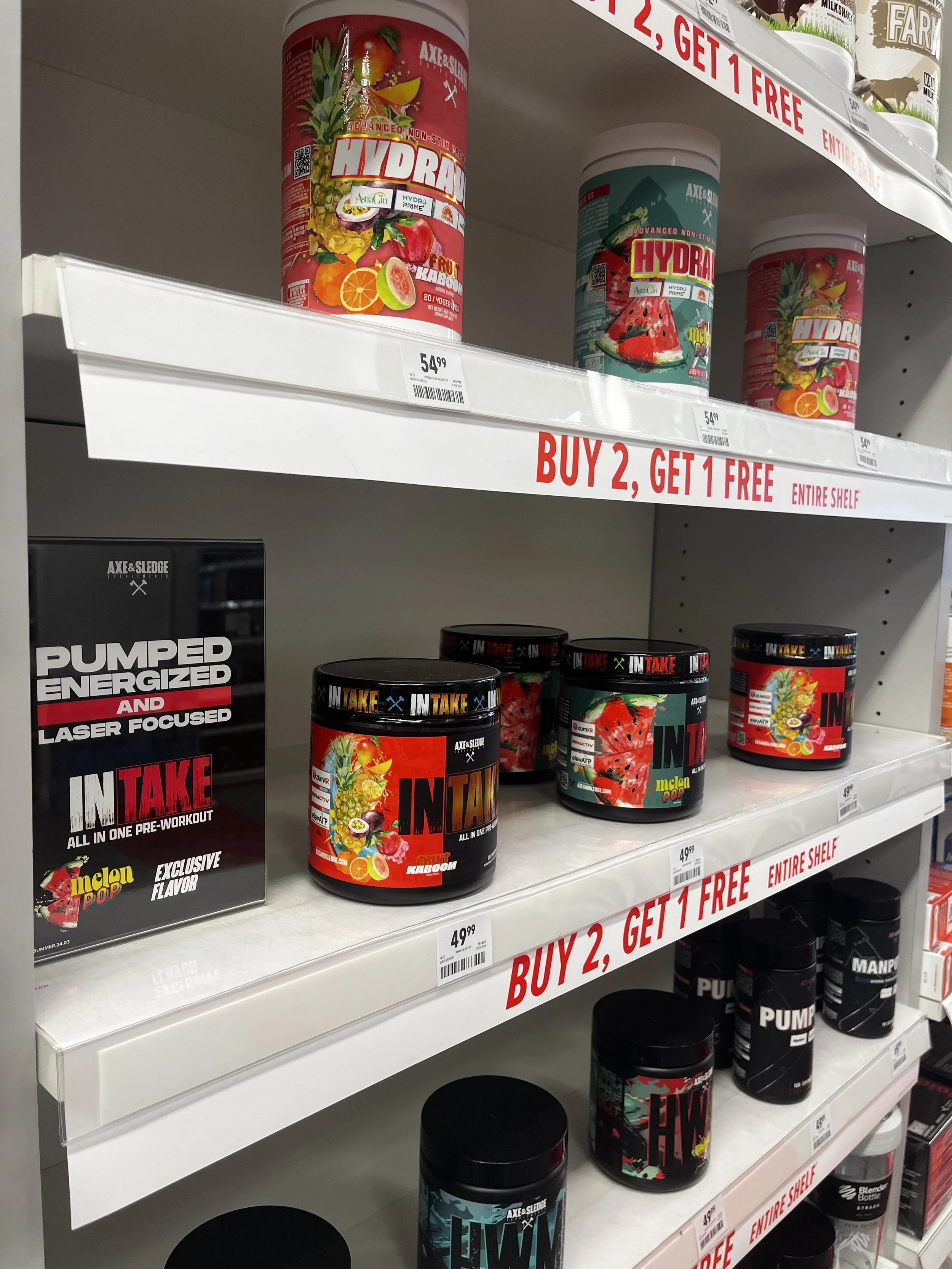
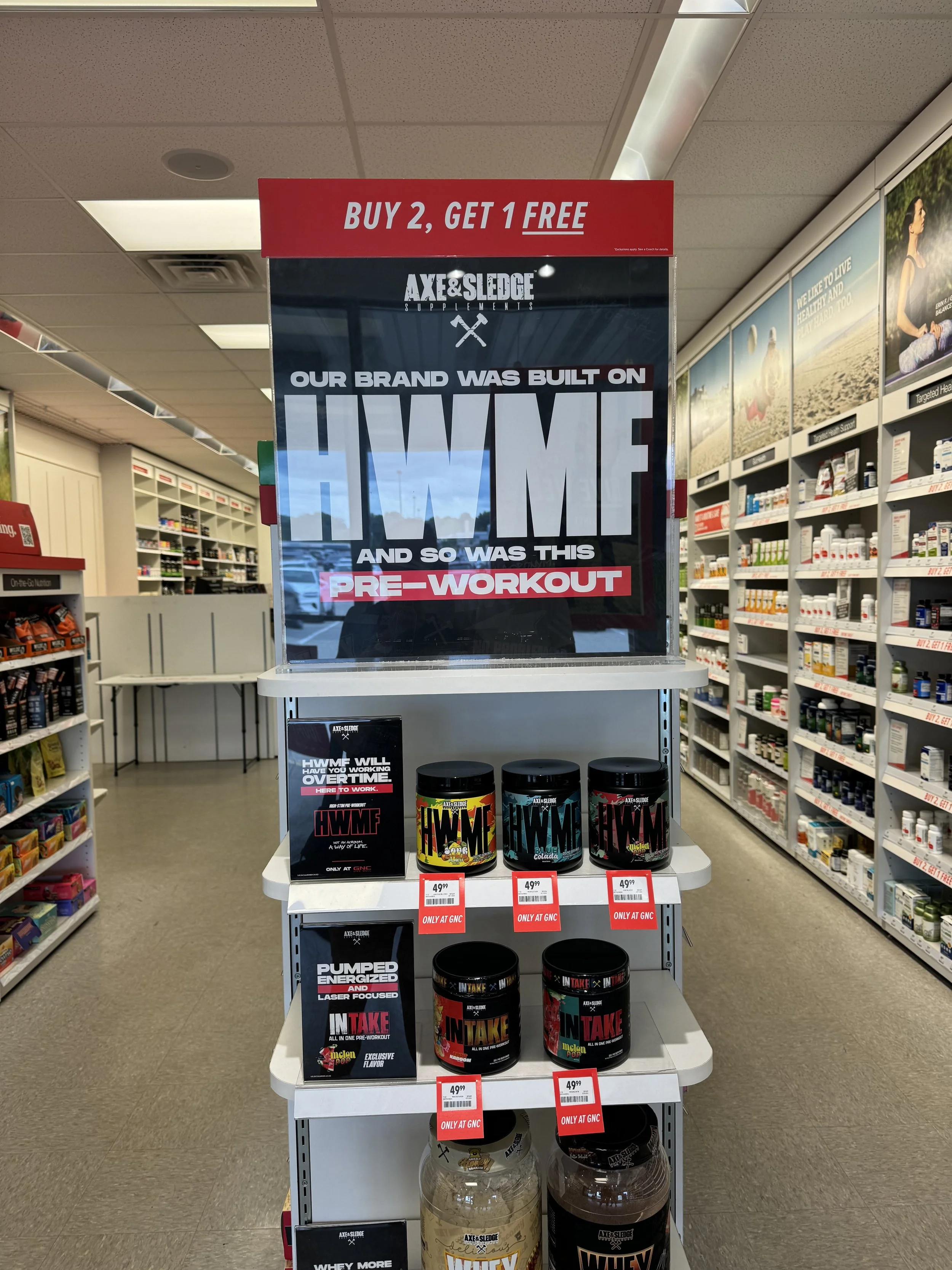
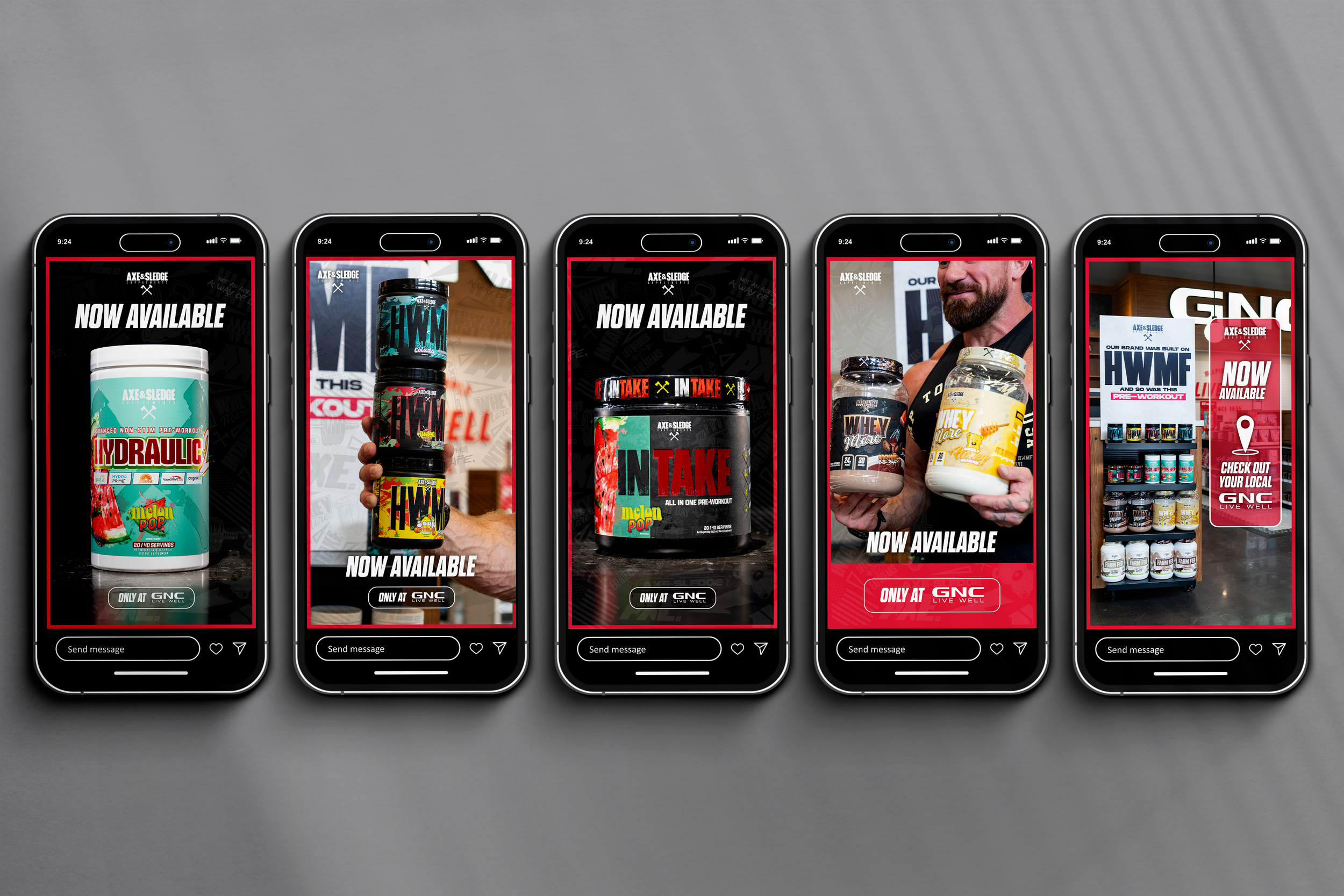
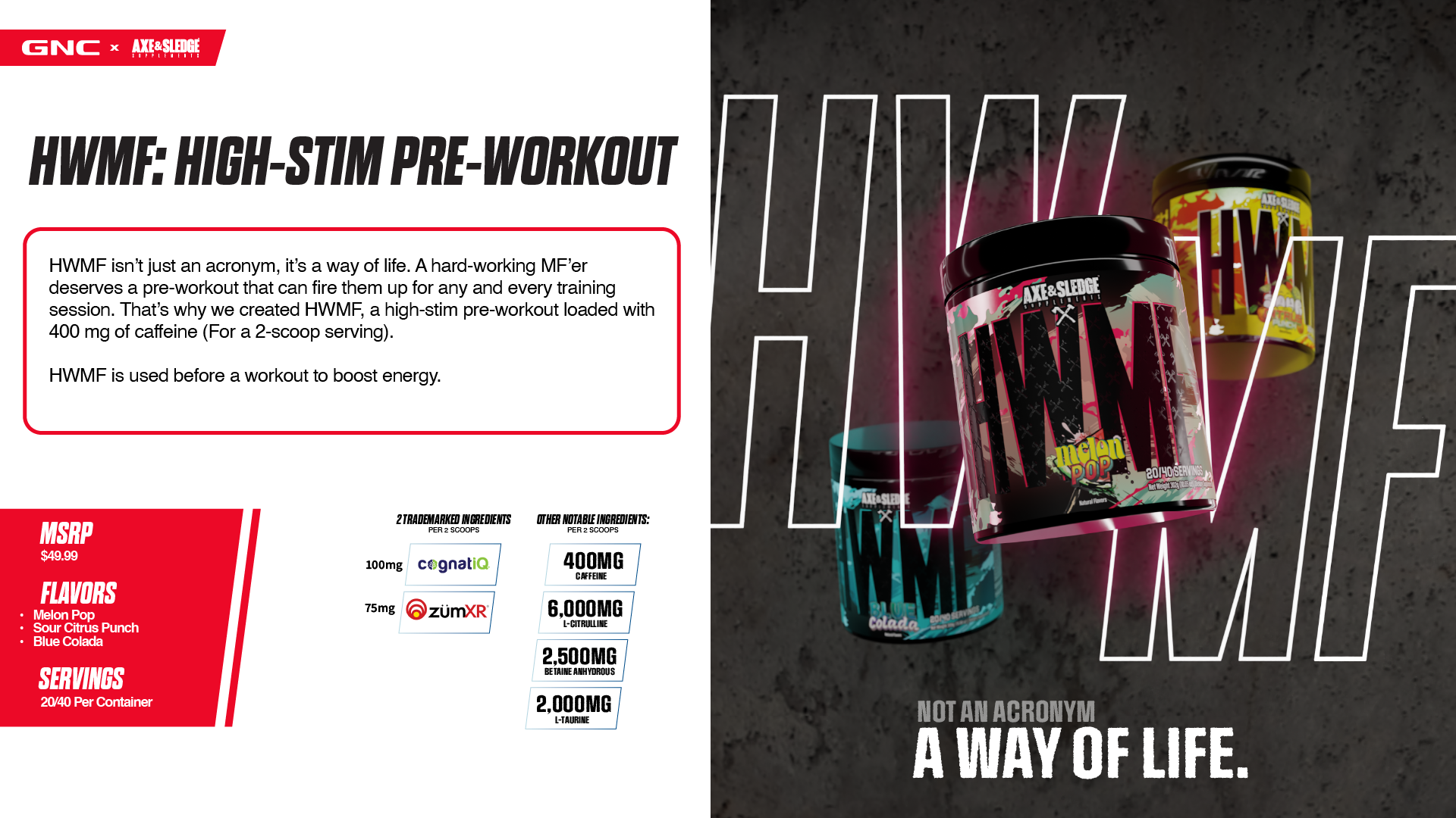
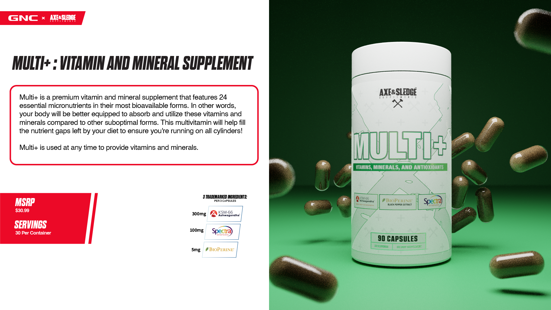
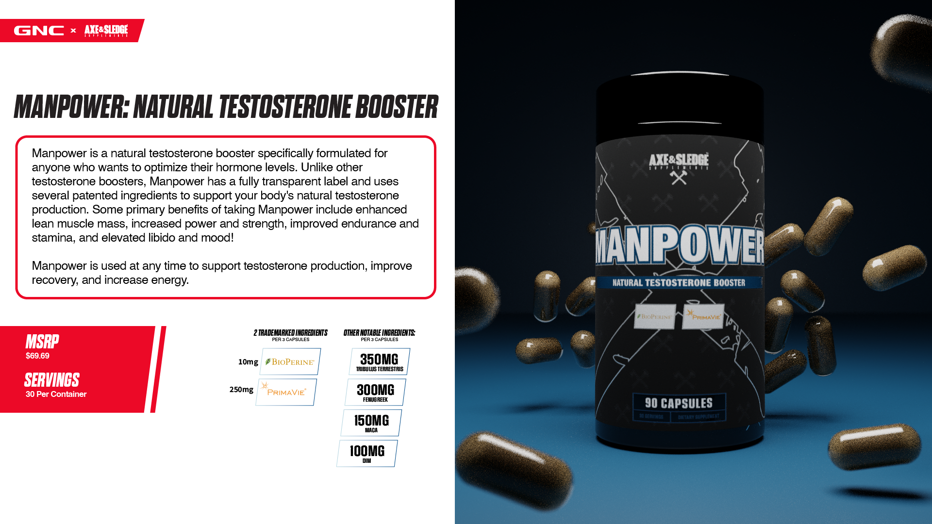
The internal materials were praised for their neat organization, consistency, and familiarity, however, creating in-store signage and promotional content needed to be approached much differently. This content needed to be much more disruptive and show more of Axe & Sledge’s true colors. One of the Co-owners and IFBB Pro, Seth Feroce, wanted to include a huge, bold, line of text that read “HWMF” (Hard Working M***** F*****). Obviously, you can imagine some of the pushback that was received from GNC after this was pitched, but in order to capture the true essence of Axe & Sledge and get the in-store reaction we wanted, GNC and Axe had to find some middle ground. We pitched a much bolder primary font as compared to the internal/B2B content (Monument Extended Ultrabold), and I was able to develop a “deli paper” style pattern that incorporated new icons mixed with some previously used ones, specifically ones that portray the core values of Axe & Sledge. Below are the final, approved versions that appeared in all GNC stores across the United States, made in collaboration with Bobby Dautrich.
Front Focal
Endcap
5” x 7” Shelf Inserts
Launch Day
GNC Global Conference 2024 Presentation Design
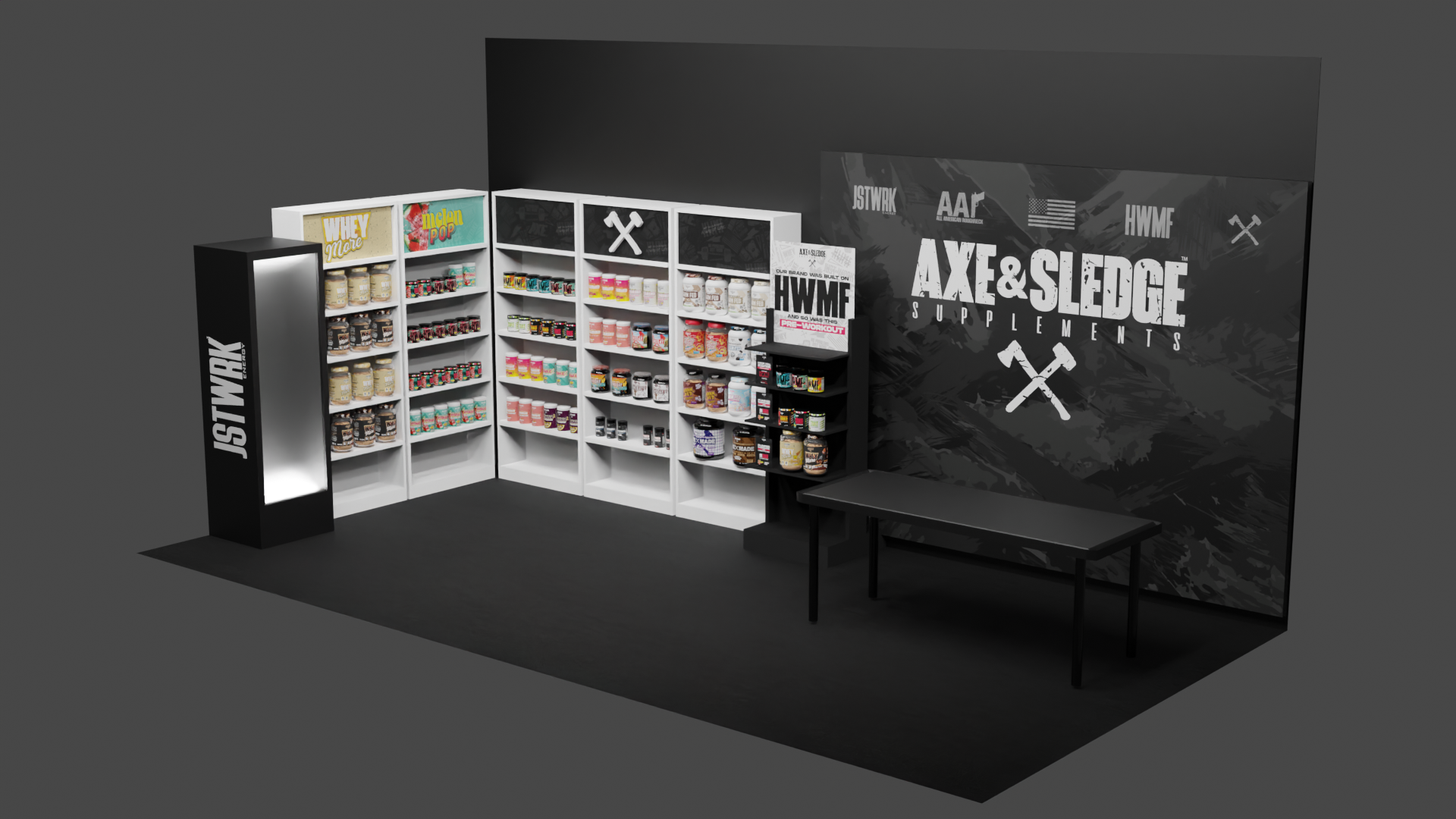
Axe & Sledge’s first public appearance as a partner with GNC was at the Global Conference at the Wynn Las Vegas. I was tasked with designing the first outward facing presentation deck to be shown to corporate, franchise, and international associates of GNC. Along with this presentation, I created all 3D renders that were included in it.
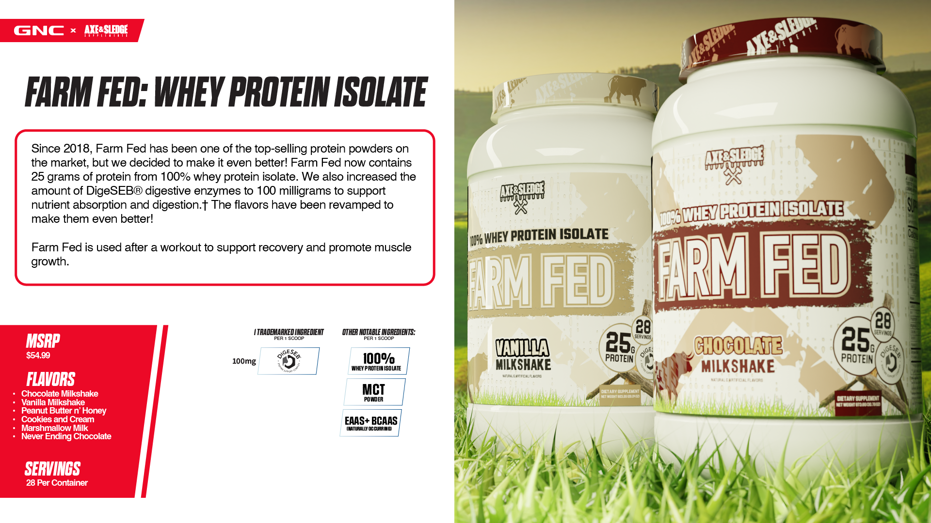
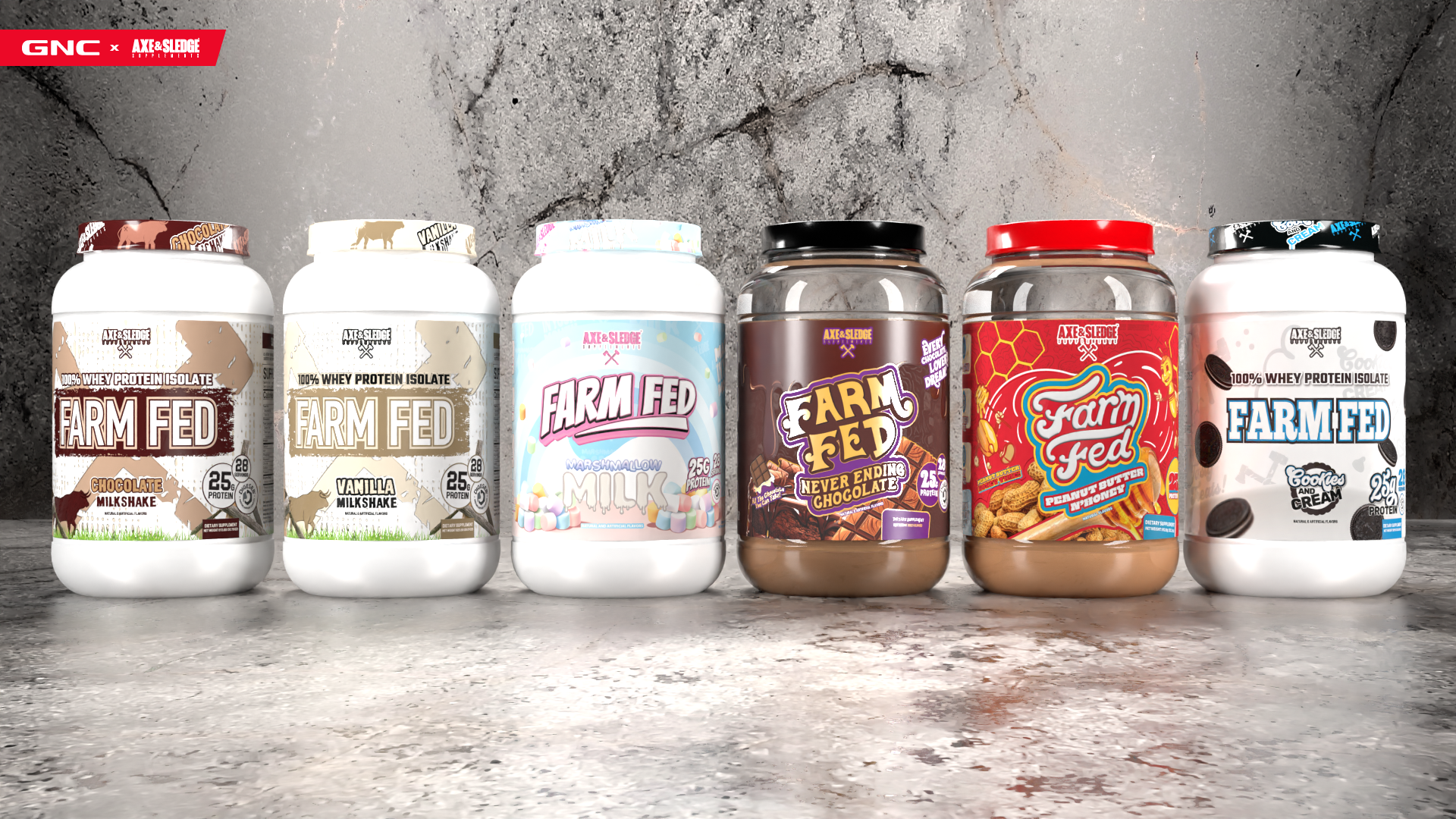
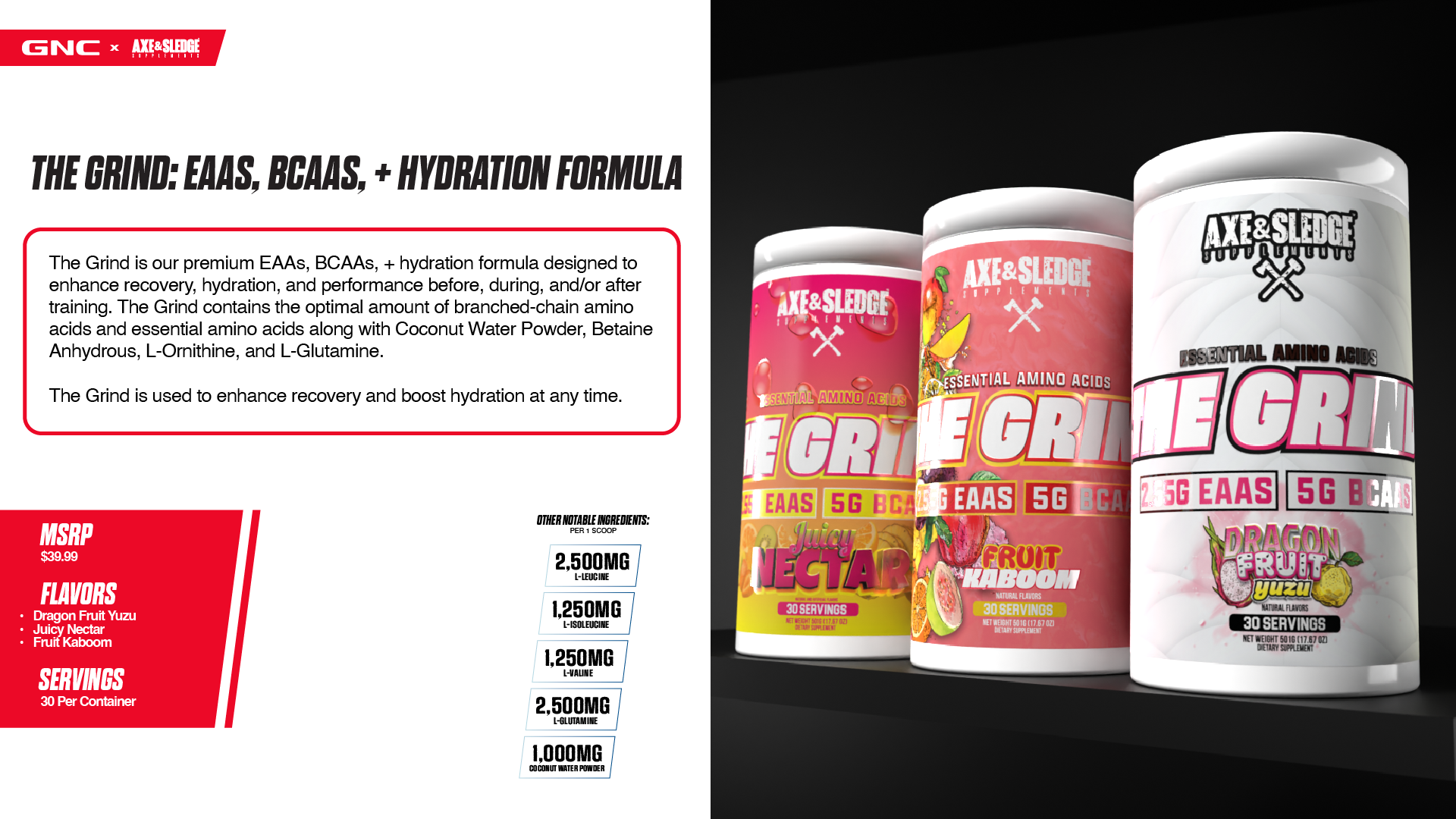
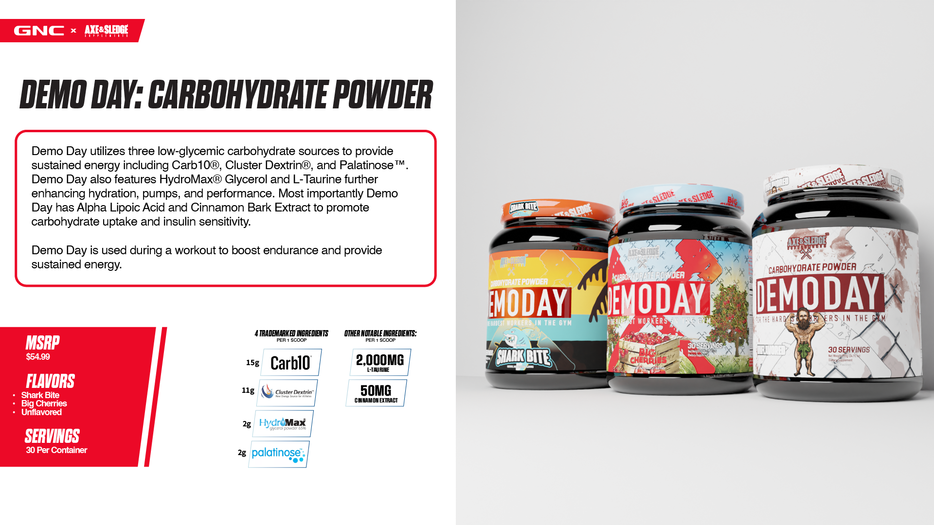
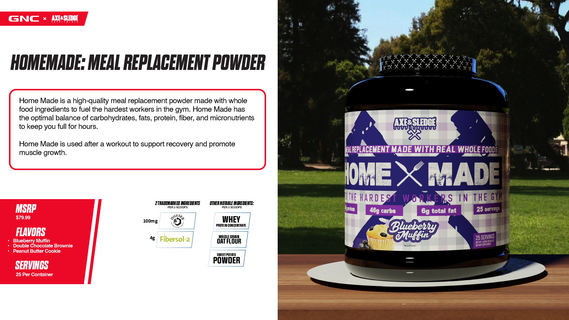
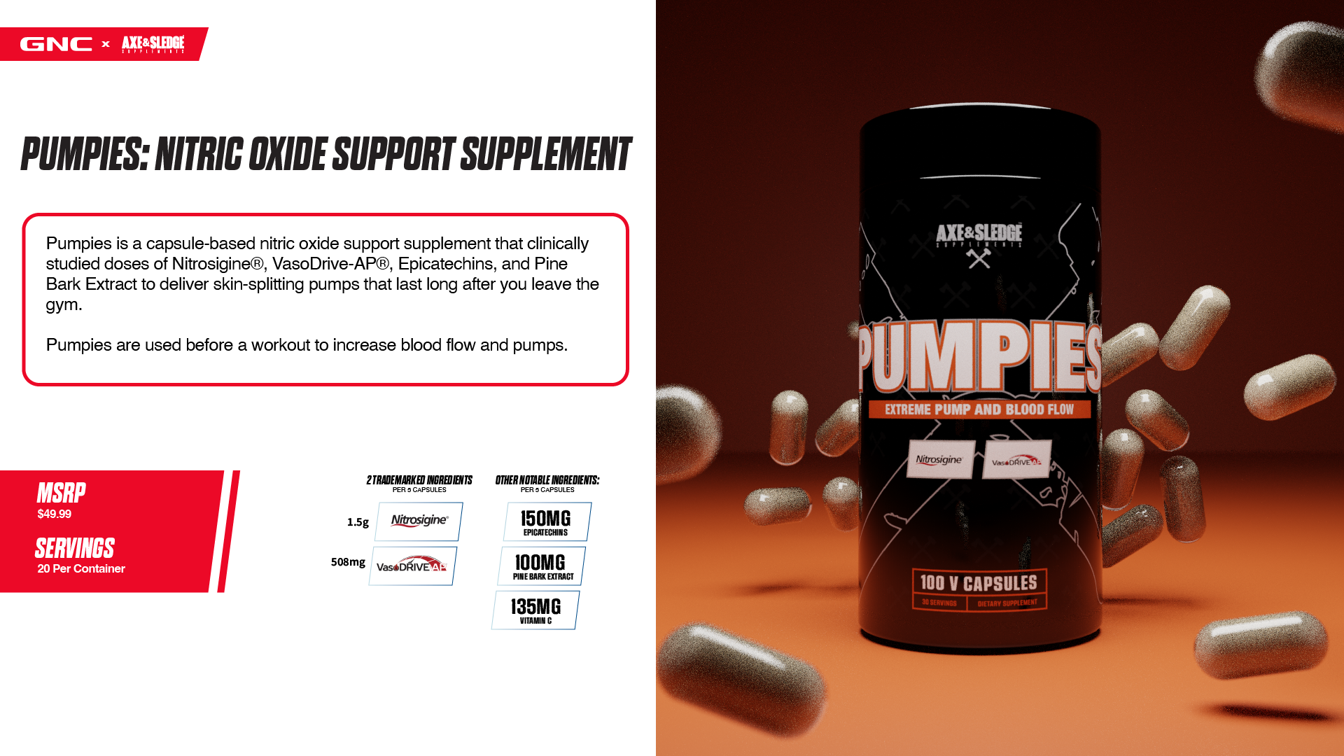
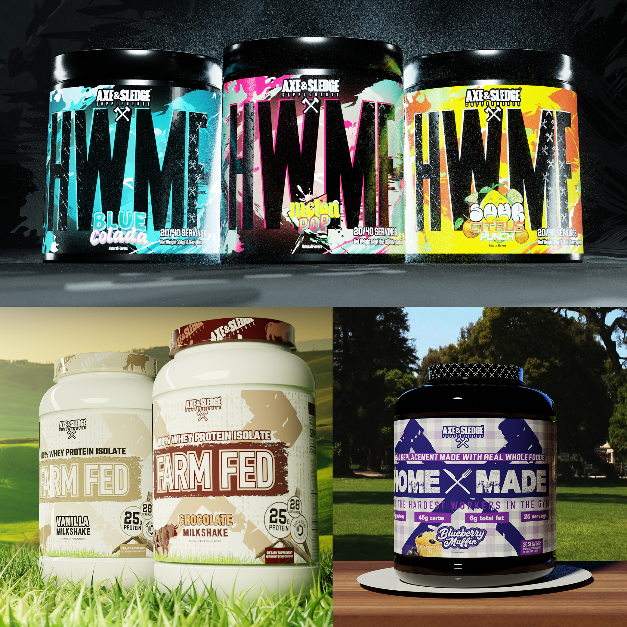
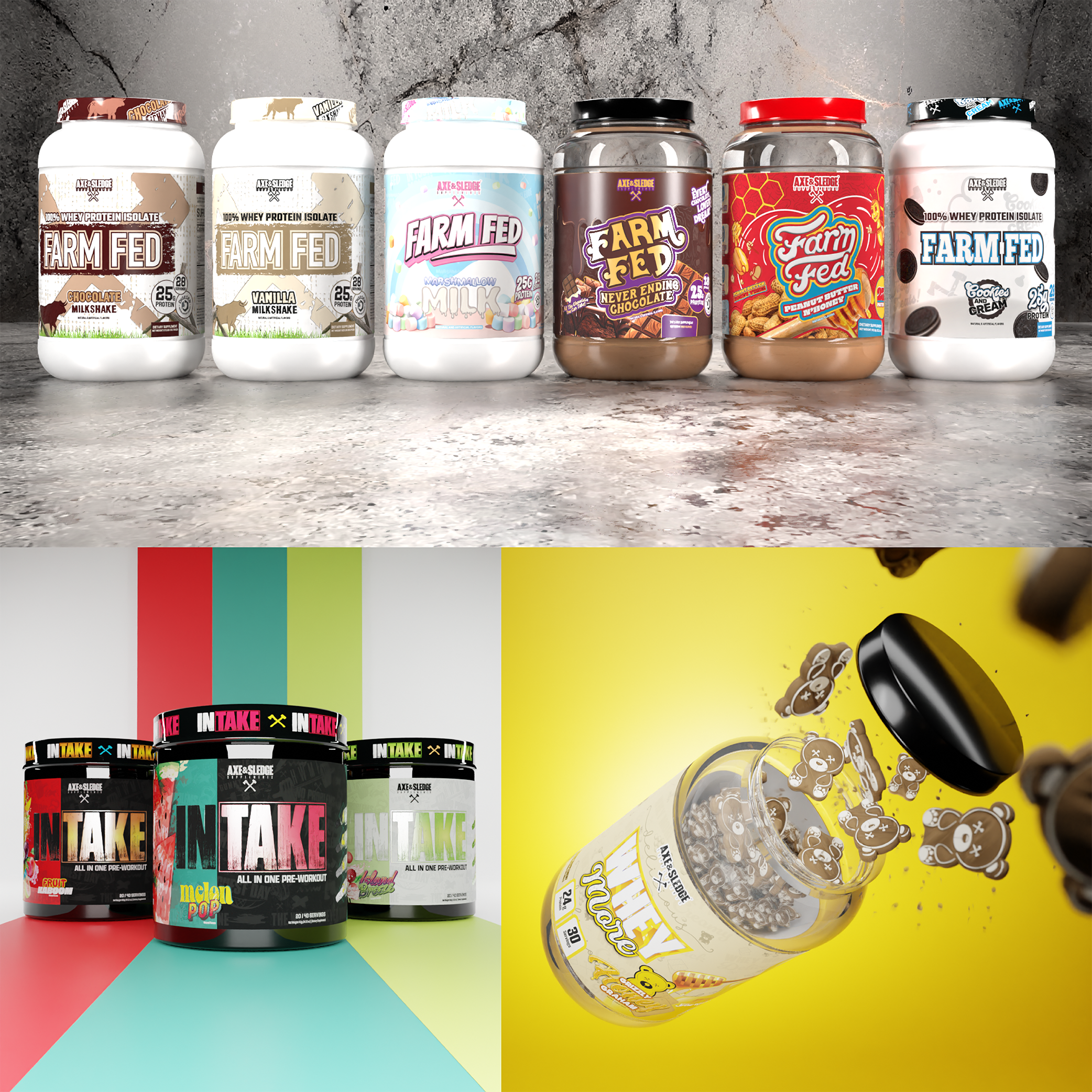
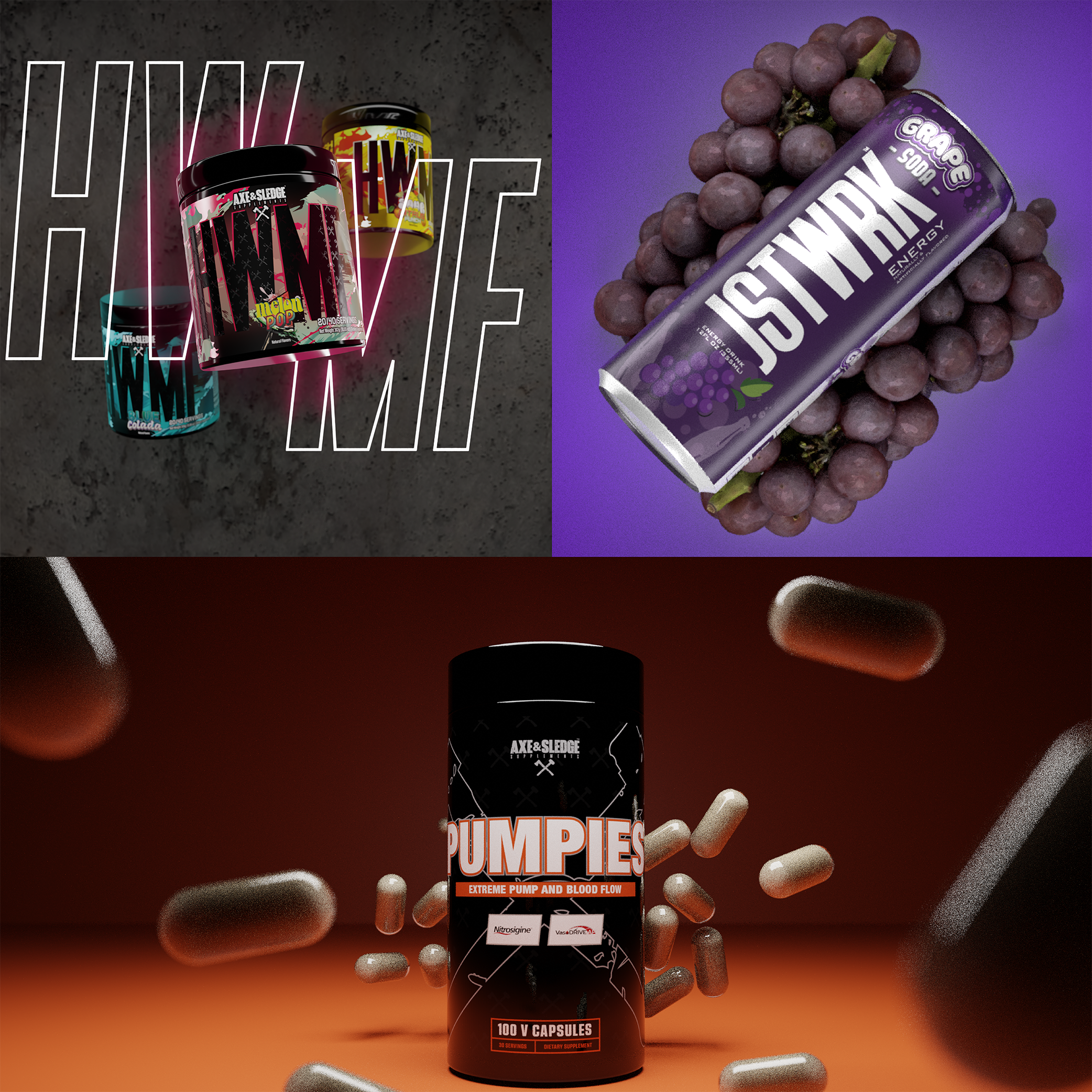
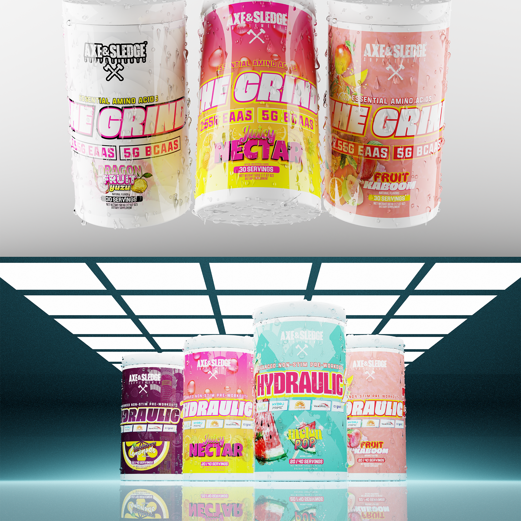
Shown here are some of my favorite 3D renders from this project, showcasing Axe & Sledge’s new products and new partnership with GNC.
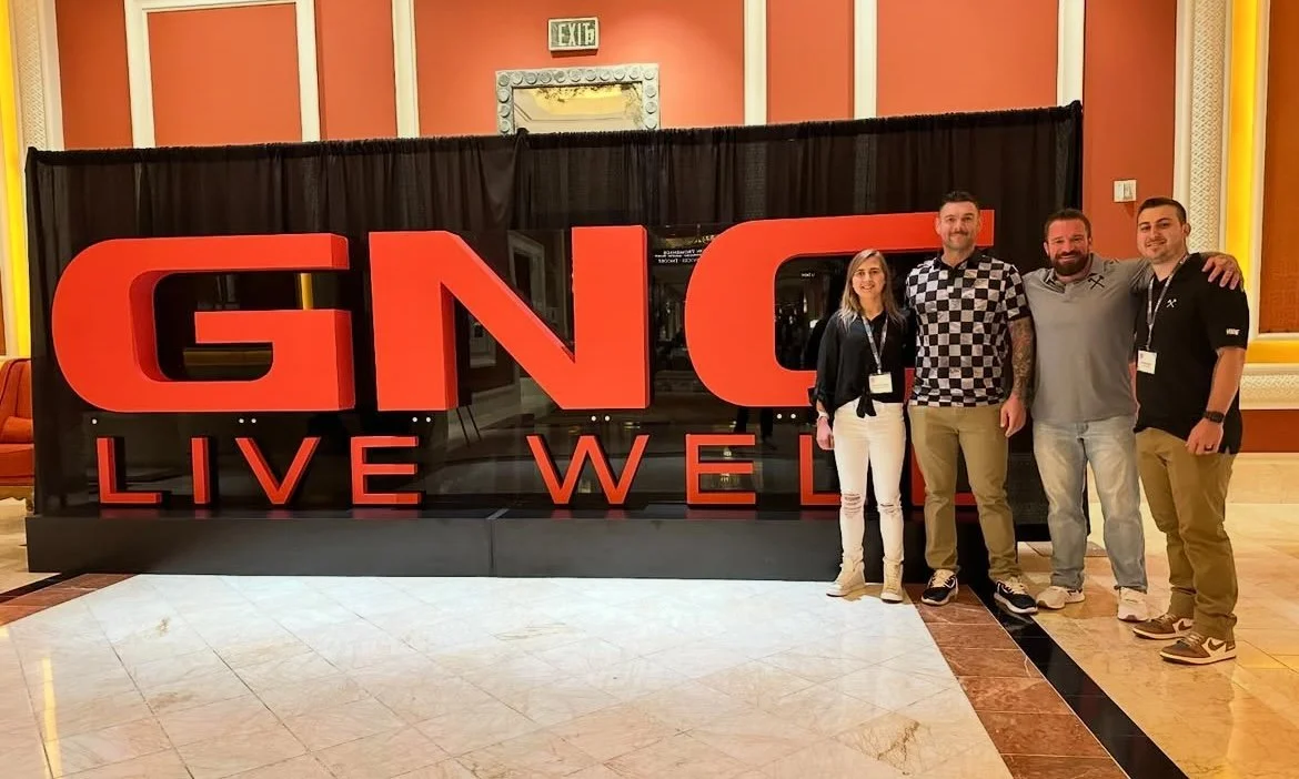
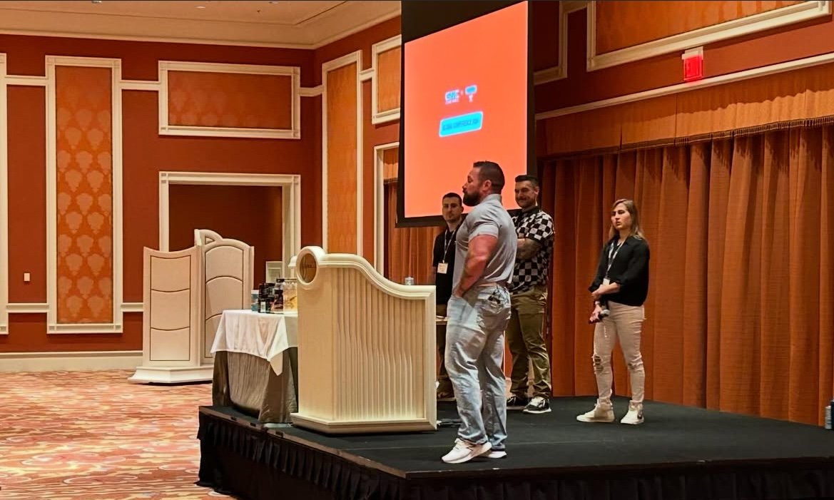
Pictured here are Axe & Sledge Co-Owners Seth Feroce and Bobby Dautrich, alongside Vice President of Operations Shane Healey and Product Development Specialist Heather Jacques as they led the discussion at the global conference in Las Vegas. This presentation led to lots of product discussion with GNC employees and franchise owners, which was the ultimate goal of Axe & Sledge’s appearance at this event.
GNC Global Conference 2024 Booth Design
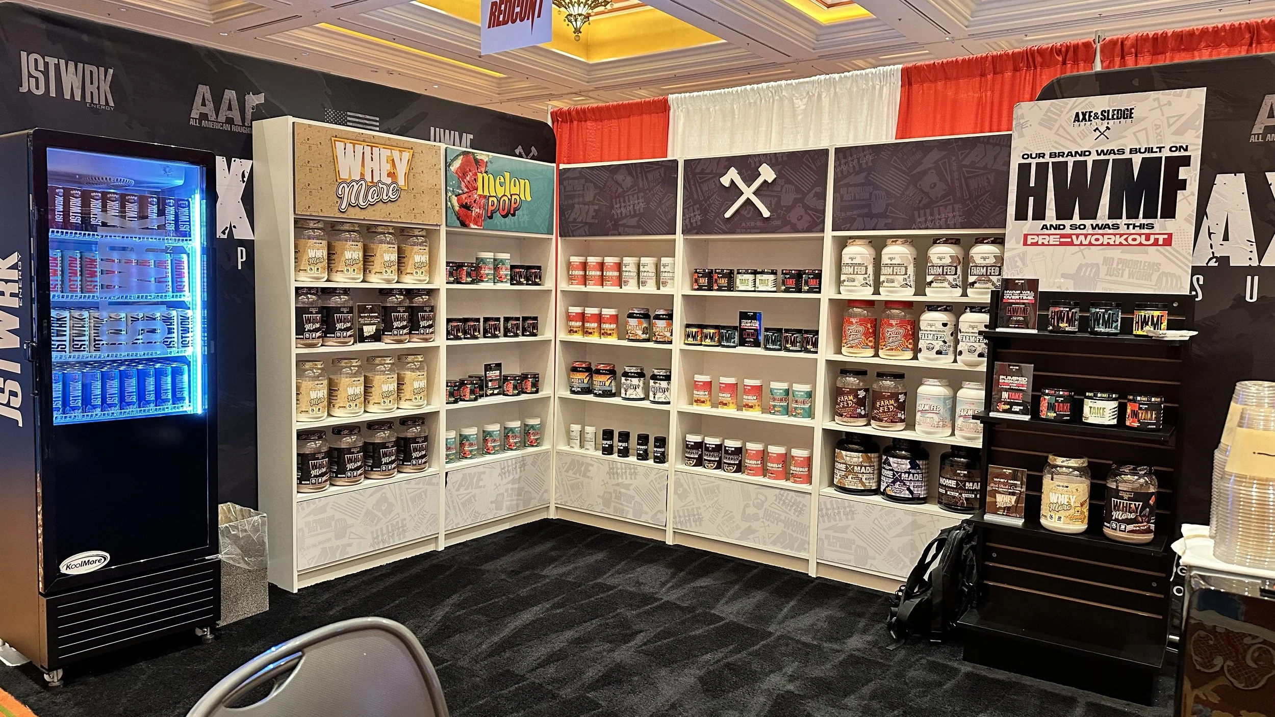
Prior to the presentation, Axe & Sledge set up a 10’ x 20’ booth alongside GNC’s other top brands to offer a closer look at new products, initialize sales to franchises, and create relationships between brand owners and GNC employees. I was tasked with laying out the booth and creating all signage, vinyl, and shelf inserts that would be included. This would be Axe & Sledge’s first impression at the GNC Global Conference. With this in mind, I wanted to continue the approach mentioned earlier, to make it seem as if Axe & Sledge had always been a part of GNC. What better way to do that than build a mini store in our booth? Complete with stocked shelves, a variation of our endcap design, and the use of the “deli paper” pattern to give it our own twist, the booth was a hit. I wanted to bring the most attention to the new GNC exclusive products and flavors, giving Whey More (GNC exclusive product) and Melon Pop (GNC exclusive flavor) their own full shelves, while all other products were much more limited. I also wanted to include the endcap near the table where people would be learning about new products, as a way to visually organize all of Axe & Sledge’s new products.
I am very thankful to have had this opportunity to work on this project with such great companies and people, as I learned so much along the way. I’m happy I was able to deliver content that was received so well internally and externally, while maintaining some level of consistency. Although very challenging, that is what makes these large projects so worthwhile.